
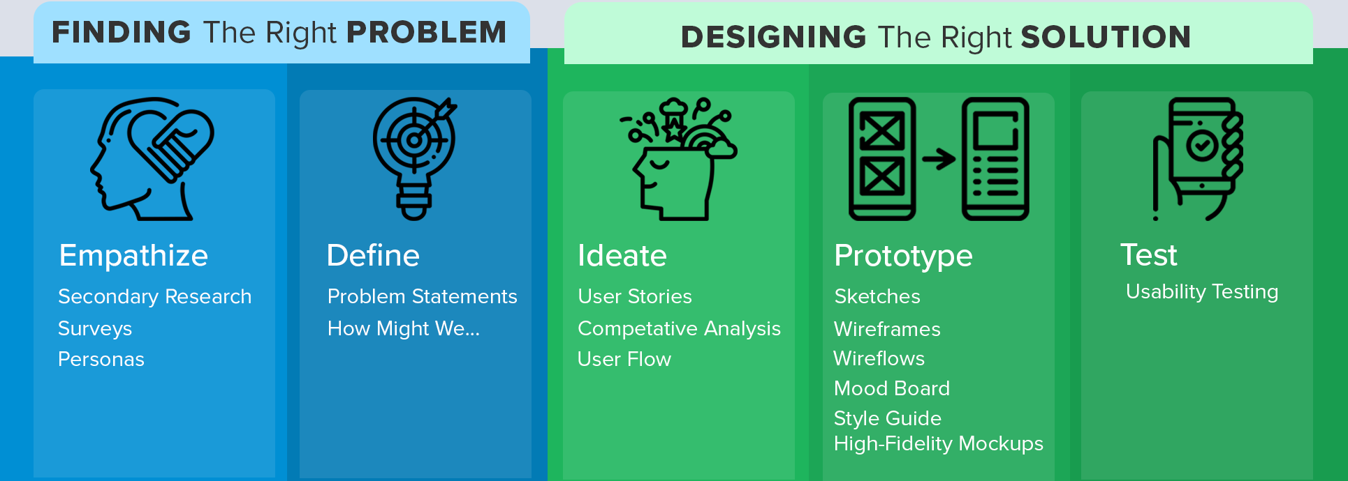
Overview
Maestro Conference is a webinar and conferencing platform which connects large numbers of people, deepening relationships and driving meaningful real-world actions. Existing customers were moving to other conferencing platforms because Maestro Conference was comparatively too confusing and more expensive. Our biggest challenge was designing an intuitive onboarding experience that would convince users that the robust functionality of Maestro Conferences’ platform more than justified its higher monthly cost.
Problem
How can we update the user interface and simplify the onboarding experience? Through design thinking and a user-centered approach, we conducted user research, designed personas, and performed a competitive analysis with Zoom and Microsoft Teams to get some initial direction in the project and then progressed through to full in-house design implementation, to reduce risk and ensure the design would satisfy Maestro Conference and our user’s needs.
My Role
In this project, I played many roles. I worked as the lead UX designer by developing project phases, timelines, distribution of work, and facilitating team collaboration on every phase of the product’s development. Team members led in different phases of the project. I was there every step of the way from secondary research, to ideation and defining up until prototyping and testing.

Secondary Research
Maestro Conference is an online conferencing platform, which has hosted over 9 million participants and earned 100k+ positive reviews for its ability to progress from a webinar/conference call into small breakouts. Because of its robust functionality when compared with other conferencing platforms, Maestro Conference customers have included the World Bank, the Obama White House (and Obama Foundation), President-Elect Joe Biden, Stanford University, and Airbnb. Guided and autonomous breakout rooms that accommodate nearly unlimited participants set Maestro Conference apart from its competitors and attract business professionals from all walks of life.
From its origin, Maestro Conference has evolved from hosting only audio conferences to full audio/video conferencing. While Maestro Conference is not trying to go head to head with leading competitors like Zoom, it holds an important place in the online conferencing world with business professionals who need the additional features Maestro Conference offers. However, securing a position in an evolving online environment has its challenges. Maestro Conference’s added functionality and robust features naturally create a more complicated system, which has caused some users to leave for other more known platforms. Users have complained that Maestro Conference is “Hard to use, set up and manage.” Here are two of their statements.
One customer stated, “Social Webinar and Guided Breakouts are hard to use as host” and the “Interface/system is a bit outdated compared to affordable options like Zoom.” Another customer shared, “Love the platform, but it is difficult to manage and coordinate with a phone line.”
“Love the platform, but it is difficult to manage and coordinate with a phone line.”
“Social Webinar and Guided Breakouts are hard to use as host” and the “Interface/system is a bit outdated compared to affordable options like Zoom.”
Our user research made it clear that for Maestro Conference to be a major contender in the online conference arena, they would need to make their onboarding and hosting platform easier for users to operate, while still featuring the additional functions Maestro Conference is known for.
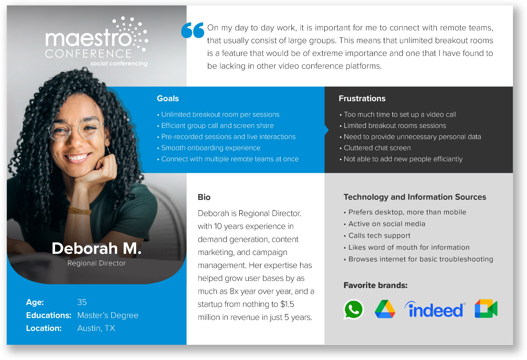
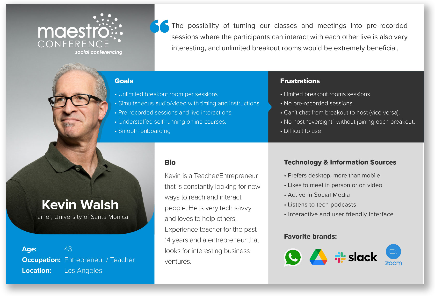
Personas
Tools: Adobe Photoshop
Online conferencing platforms appeal to a nearly endless range of users. Our first challenge was defining who we were designing our onboarding experience for. User research revealed that Maestro Conference was not trying to appeal to the average user who is only interested in free platforms, but for the business professional who would willing to pay a monthly subscription for a more powerful system. Our team examined a survey with over 500 actual Maestro Conference customers, which gave us an accurate depiction of the type of person we needed to appeal to. We decided to create two personas, which reflect the majority of Maestro Conference’s users.

Problem Statements
In this stage of the process I needed to clearly articulate the problem I wanted to solve. PROBLEM STATEMENTS I gave me the mental clarity to solve the problem that I wanted to design a solution for.
Our task was clear. Create a simpler and up-to-date onboarding experience that would justify the platform’s higher monthly subscription cost.
Our team conducted a brainstorming session, in which we wrote down as many “How Might We…” statements as we could think of and then narrowed down these statements to the most viable project (MVP). From this exercise, we arrived at the following statements.
How Might We…
- Help users easily navigate through the onboarding experience to enjoy a conference?
- Update the user interface to provide a visually more interesting and user-friendly experience?
These 2 questions helped me enhance the project without forgetting the main purpose.

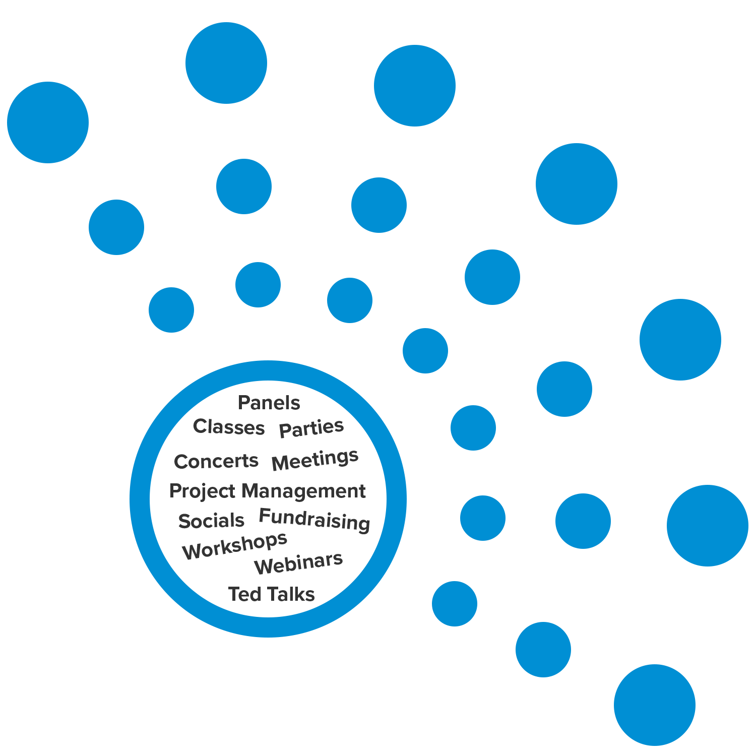
As you might expect from an online conference platform, users looked to Maestro Conference to meet a broad range of needs.
User Stories
Tools: Miro
I used User Stories to identify the functional needs of the product. I wanted to build without getting into the details or designing the product itself. Our team conducted a brainstorming session, in which we wrote down, categorized, and prioritized various user stories.
Four priorities emerged, with priorities 1 and 2 directly related to our MVP. I have omitted from this case study priority 3 and 4 user stories as they are not relevant to our project.
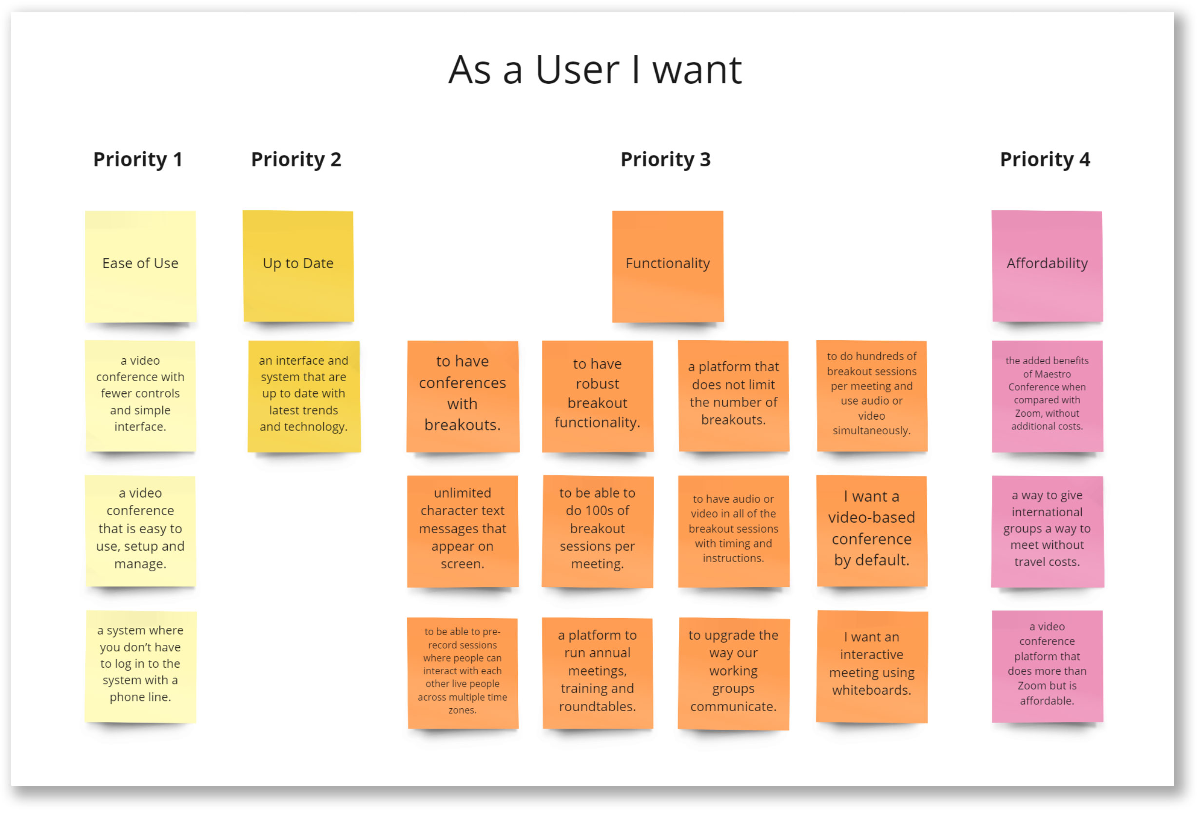
Through the entire process, these user stories helped me stay focused on the user experience. This was particularly important in the UI design stage: every design element in the interface corresponds to one of these stories.
Competitive Analysis
We performed a competitive analysis between Maestro Conference, Zoom, and Microsoft Teams. During this exercise we documented each onboarding process, captured screenshots of each step, analyzed and compared user flows, identified industry standards, best practices, and compared the pros and cons of each platform. This exercise allowed us to get a better understanding of what works, what users have come to expect, and gave us insights as to how we could improve the Maestro Conference onboarding experience.
For this case study, I only include key screenshots with summarized evaluations.
Zoom
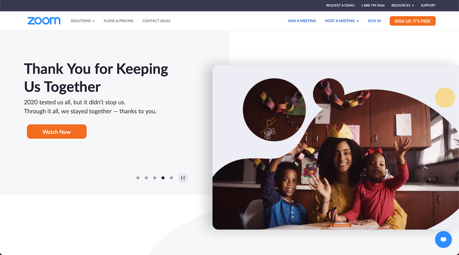
Home Page. Zoom uses well the location of the SIGN UP, IT’S FREE button by placing it in the upper right top navigation where users expect to see it. The bright orange button draws the user’s attention, identifying it as one of the primary actions of the home page. Sign In fields for existing users prominently appear in the body of the page and the second SIGN IN link is located in the top navigation. Users quickly understand the purpose of this page. The page is void of any promotional offers, advertisements, video tutorials, or other elements that could distract users from signing up or signing in.
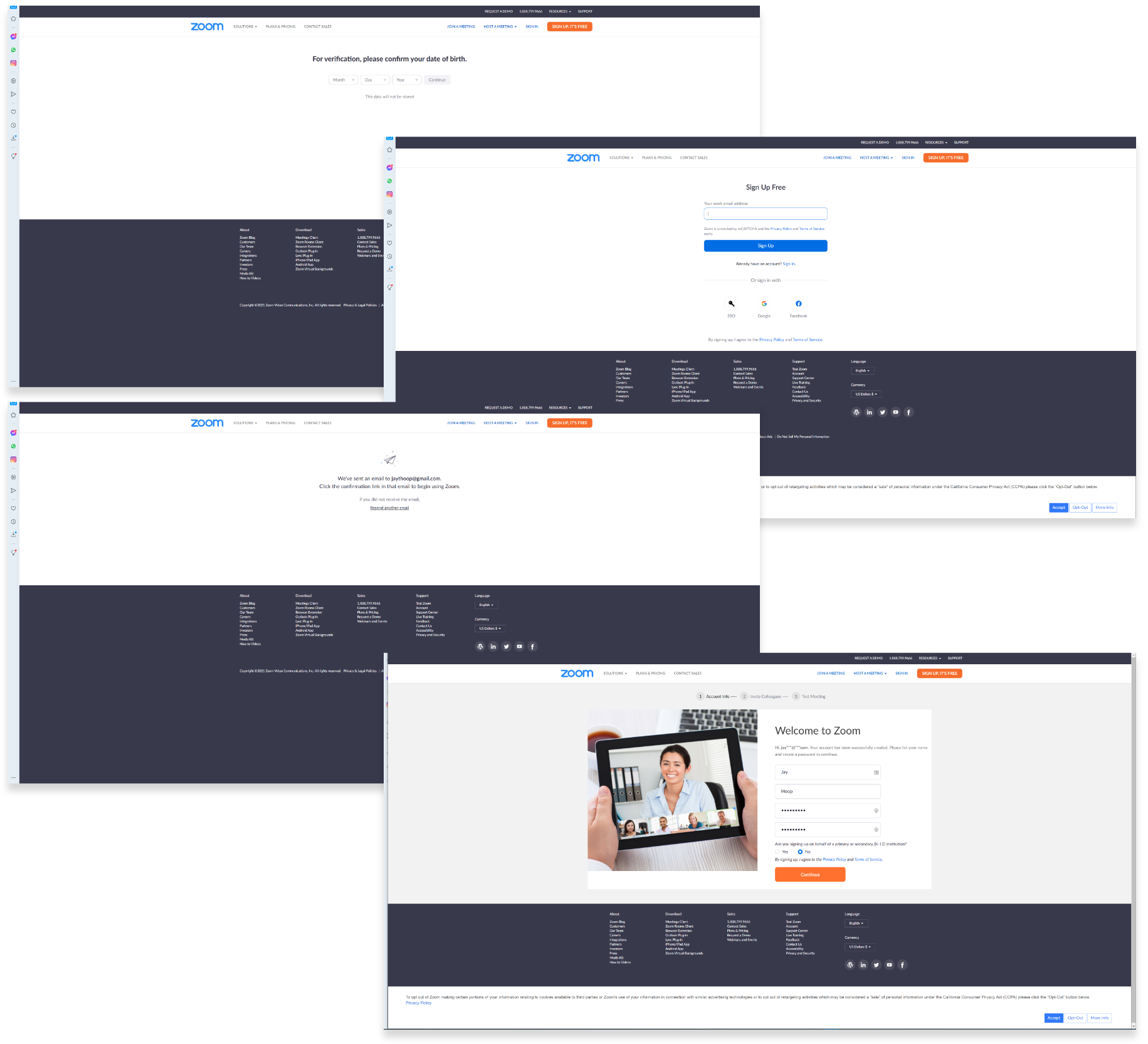
Beginning Onboarding Screens. The onboarding experience begins with the user entering a date of birth, email, and then confirming the email. The user is brought back to the home page and asked to provide a first and last name, enter and confirm a password and press the orange Continue button. While most users tolerate the inconvenience of confirming information, Zoom can create a better experience by placing the name and password fields in the same screen with the user’s date of birth and email.
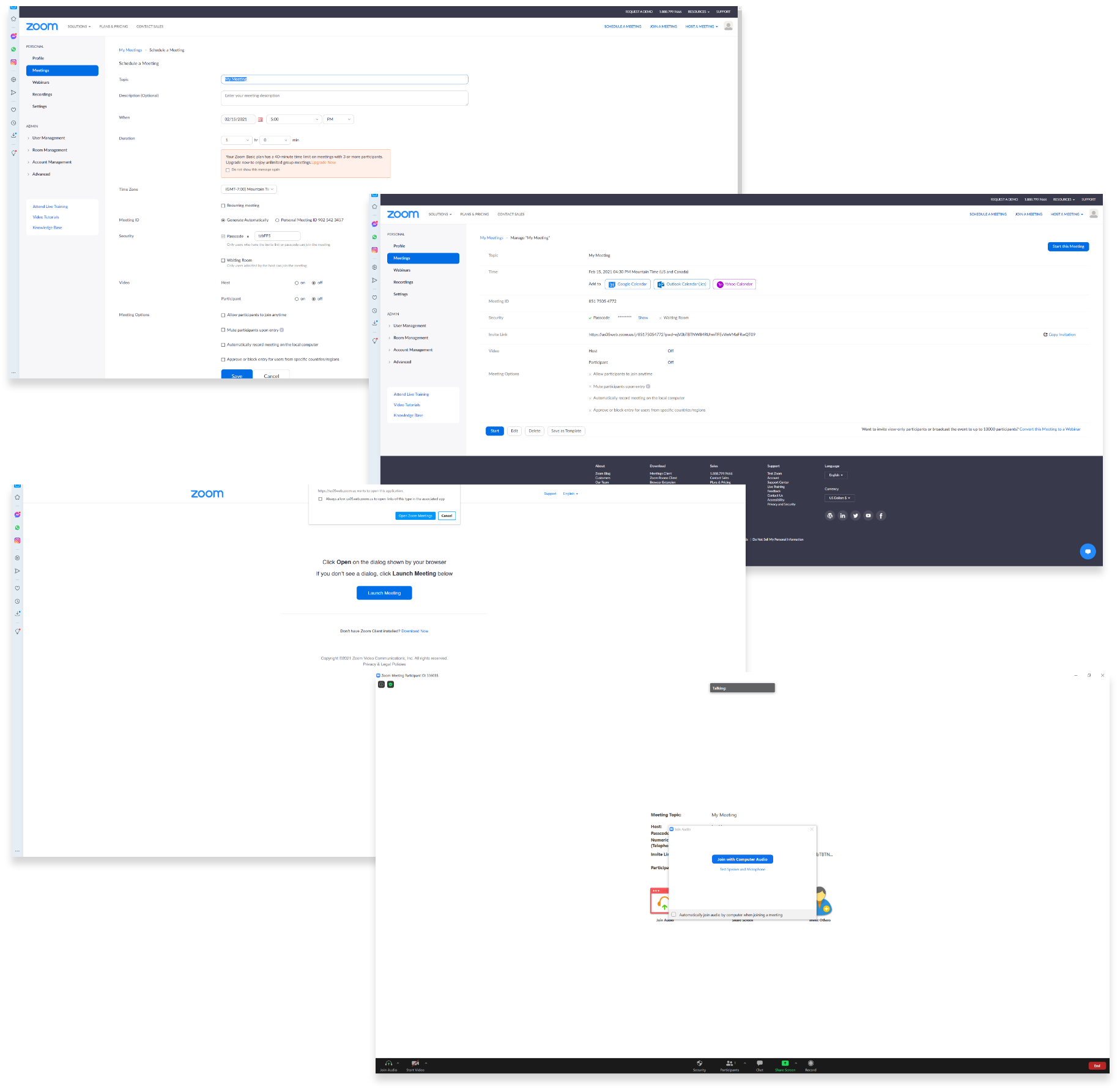
Main Navigation Page. Zoom’s main navigation page is organized in a manner that users can explore all the different options Zoom provides. I focussed my attention on those actions that lead to creating a new Zoom meeting. In the upper right side of the top navigation, users can Schedule a Meeting, Join a Meeting or Host a Meeting, or click on Meetings in the left navigation menu to Schedule a Meeting. Scheduling a meeting was easy to do and the user interface was fairly simple.
Schedule a Meeting page. The Schedule a Meeting page, contains all of the settings users need to hold a meeting. The default settings are automatically set, making it easy for users to navigate through this screen. User settings are organized and easy to understand. Good job Zoom!
Manage My Meetings page. This page allows users to add a meeting to popular calendars including Google, Outlook, and Yahoo. For some reason, Zoom includes additional settings on this page. I assume that A/B testing would reveal that users would prefer that these settings be on the Schedule a Meeting page. An easily seen and clearly labeled button in the upper right of the main body allows users to Start this Meeting.
Join with Computer Audio page. Zoom leads users through two screens, the first opens the Zoom meeting in an app window and the second is shown above. This page connects the Zoom meeting with a user’s computer audio. From a user’s perspective, these two steps are annoying. However, users generally understand the need for and tolerate system-required screens. Automating these controls would create a more seamless onboarding experience.
Zoom Meeting Page. Zoom creates an enjoyable video meeting experience through a dark theme and large video window. Placing the meeting controls at the bottom of the screen allows users to adjust settings, without taking away from the focus of the video display. Zoom utilizes the principle “less is more” through a simple video format.
While the onboarding process was not overly complicated, Zoom can create a better user experience by combining information from multiple pages. There is a gentle balance to this. Putting too much non-homogeneous information on the same screen can create confusion. However, in this case, the information requested by Zoom can be combined thus simplifying the process without overloading users.
Microsoft Teams
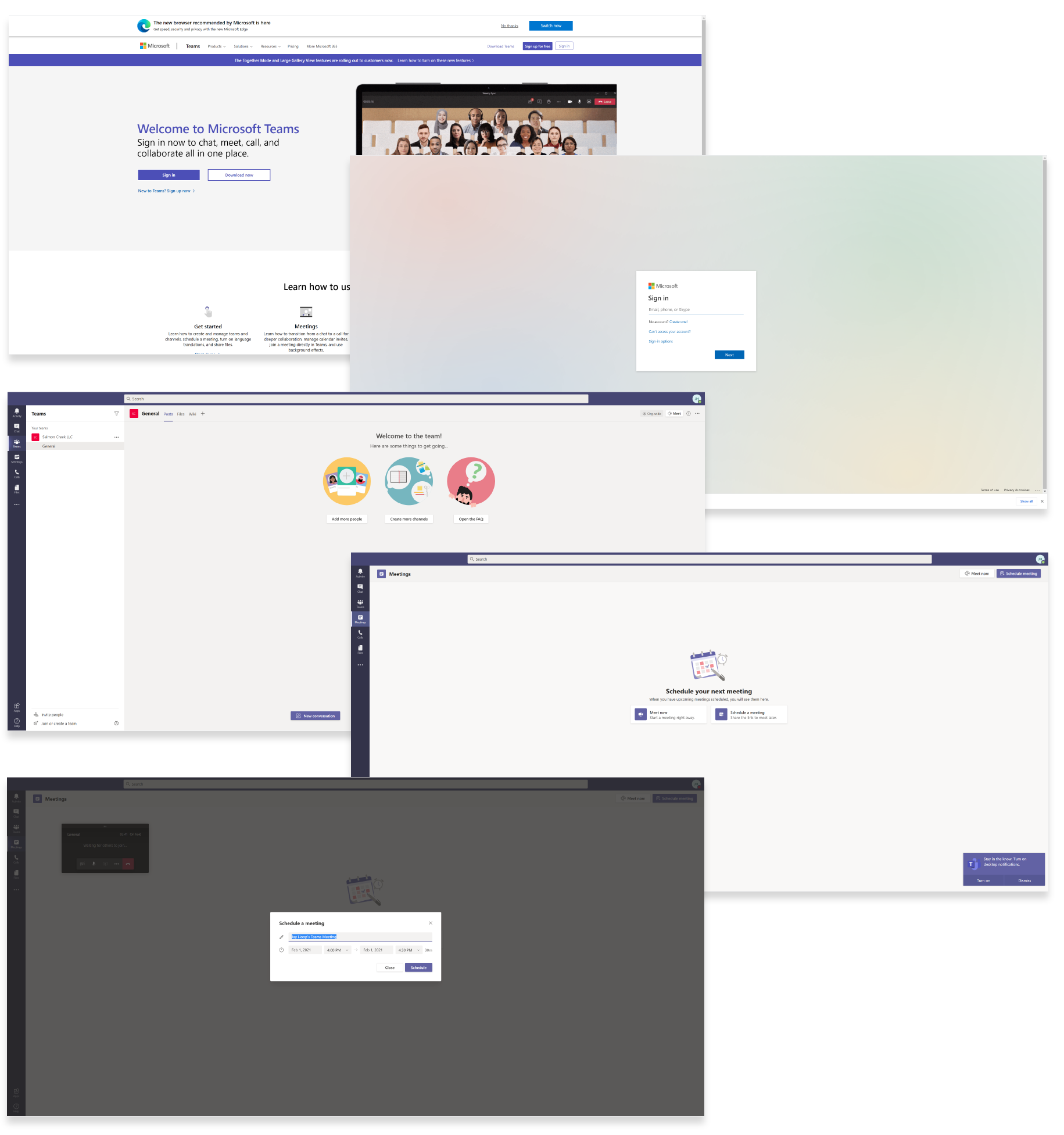
Home page. Sign up and Sign in buttons or links are easy to see and are located in the top navigation and main banner areas where users expect them. The Sign up for free solid blue button draws the user’s attention and shows hierarchical dominance when compared with Sign in. Additionally, in the main banner, users can easily see a hyperlinked call to action New to Teams? Sign up now >.
Welcome to the team! Main navigation page. After entering a typical username and password field, users are brought to the main navigation page. “Welcome to the team” signifies success. Summarized instruction, images, and buttons help users to “get going”. Microsoft Teams helps users stay focused by only including images, text, and buttons that help users accomplish their goals. From this location, users can navigate to any desired destination.
Meetings page. The left navigation shows user-friendly icons and options. When users select any one of the left navigation options, the main window displays corresponding actions. In the screenshot above, the Meetings tab is highlighted and the main window provides users with two simple actions Meet now or Schedule a meeting. Calls to action are clear and images support the intended purpose.
Schedule a meeting popup window. Clicking on the Schedule a meeting button opens a popup window, which allows users to name a meeting and schedule a time and date for the meeting. Unlike Zoom, users are not provided with a lot of meeting settings. The schedule of the meeting popup window is simple, clear and user friendly.
In Meeting Page. Users immediately know they are in a meeting as the theme color transitions from light to dark and the video camera is on. Meeting control icons display near the bottom center of the screen, meeting files show at the bottom of the screen and the main left navigation items persist. Clicking the chat icon opens a chat window on the right side of the meeting screen. All icons are clear and easy to understand.
Microsoft Team’s onboarding experience was simple and straightforward. The main navigation page was clear and easy to navigate. Meeting Now, or Scheduling a Meeting was easy to do. Entering a call and navigating the meeting controls was intuitive. From a user’s perspective, I give Microsoft Teams an “A” Congratulations on a job well done!
User Flow
Tools: Miro
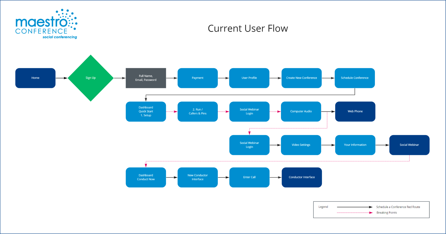
Customers complained that Maestro Conference’s onboarding process was confusing. To understand the user, we ran through the onboarding process multiple times, during which we mapped out the user flow and captured screenshots of the entire process. From this work, we identified the following pain points.
- Users are required to give credit card information before deciding they want to use Maestro Conference.
- Users are required to enter non-essential information.
- The onboarding process does not guide the user through each step.
- Multiple choices increase user confusion.
- Promotional offers and training videos distract user attention.
- Next step actions are not clear and misleading, causing user frustration and confusion.
- Scheduling a conference requires users to input the same information multiple times (eg. Username, PINs).
- The system creates a series of PINs and requires users to manually enter them in multiple places.
- Once a user has “dialed in”, the system indicates they have joined the conference, when they still need to activate the video settings and “Social Webinar”.
- The host must return to the dashboard, click Conduct Now > Enter Call to open the Conductor Interface – Host Control Panel.
- Once the conference has begun, the host must navigate between 3 open browser tabs (Web Phone, Social Webinar, Conductor Interface) to adjust audio settings, host control settings, and the video conference interface.
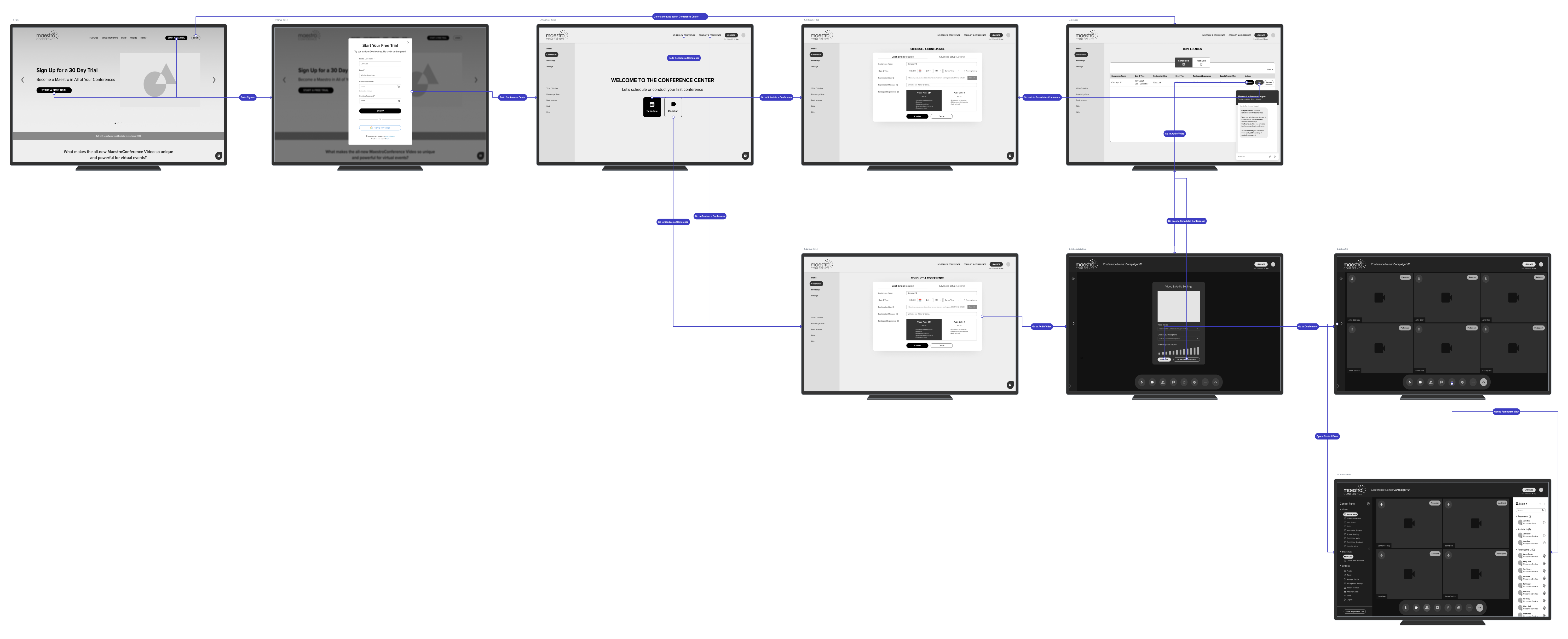
The “Current User Flow” below details the entire onboarding process beginning with Sign up and ending with the user in a conference call. The red dotted arrows are breaking points. These breaking points are areas of confusion. Our goal was to significantly reduce user confusion through a streamlined onboarding process which reduced the current Maestro Conference onboarding experience from 18 steps to 6.
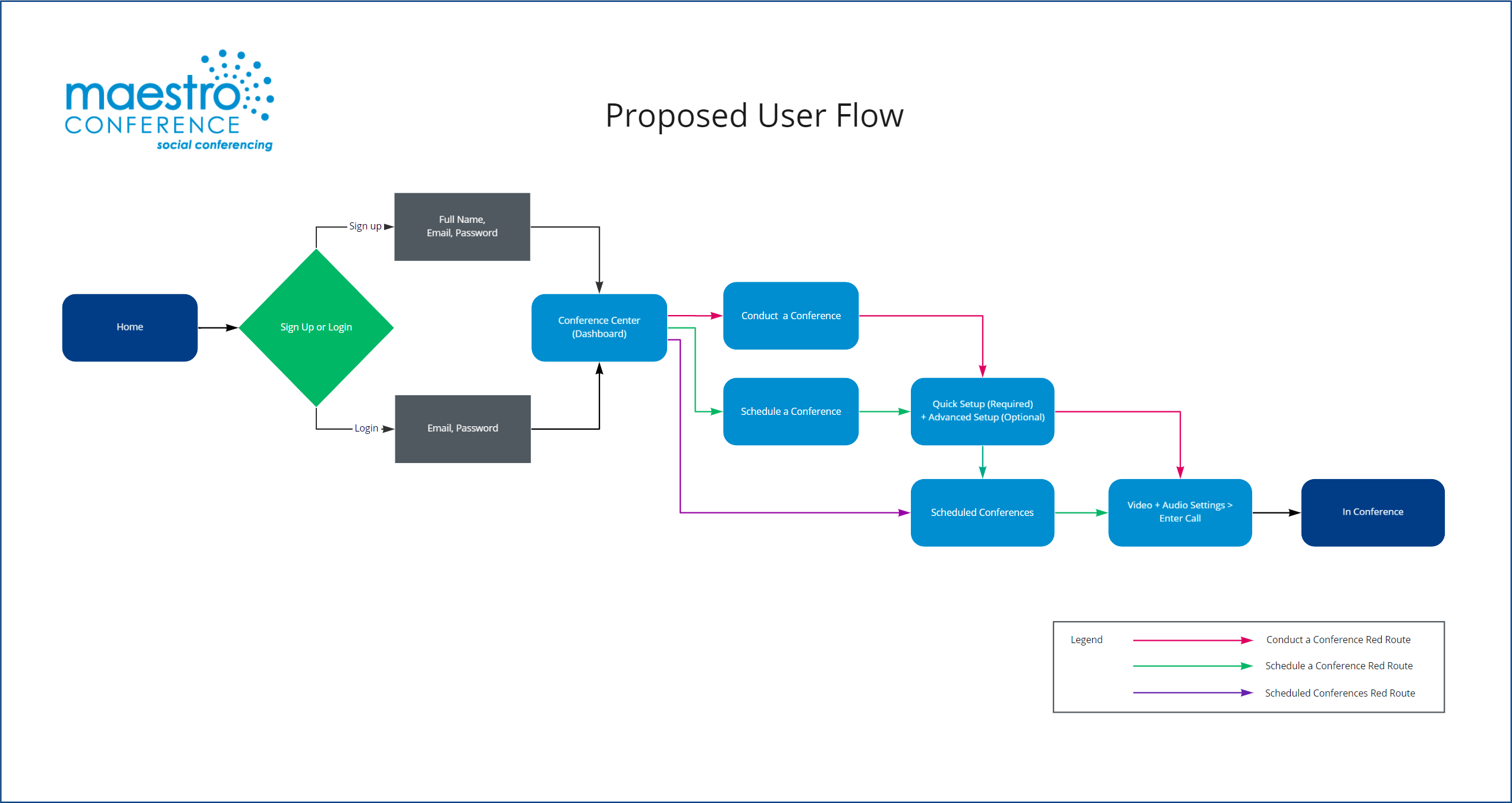
A careful comparison between the “Current User Flow” and the “Proposed User Flow” will show that our work paid off. We reduced the user flow to a simple and intuitive process. Our greatest challenge was streamlining the user flow, without compromising needed information.

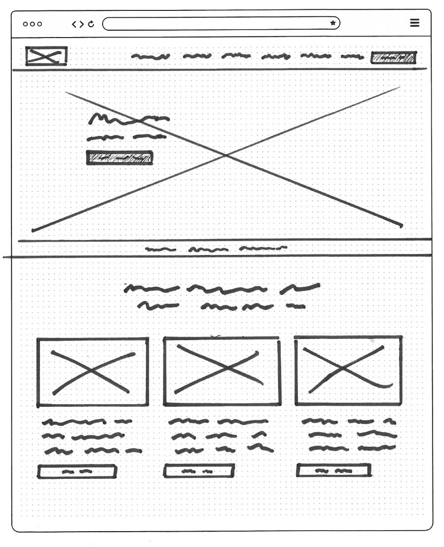
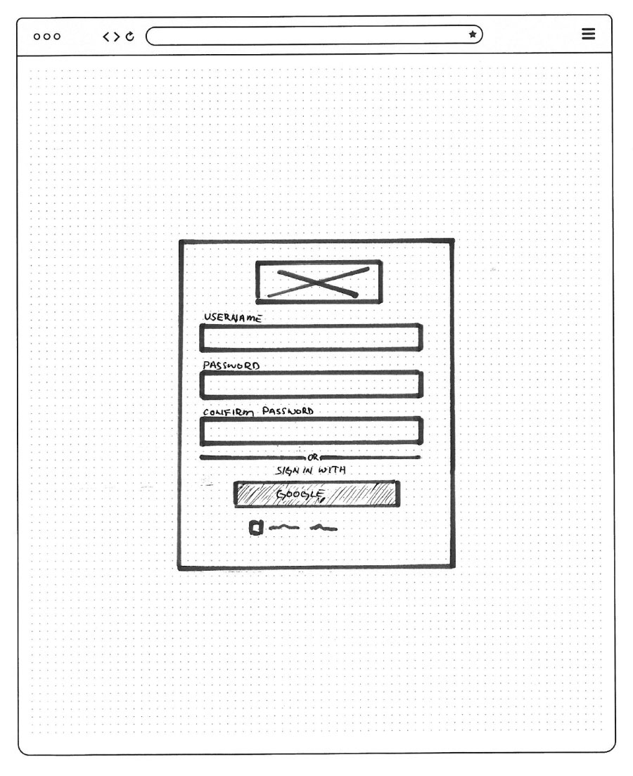
Sketches
The competitive analysis and user flow provided us with a good foundation and sparked ideas from which we explored possible designs. But before we began sketching, we met as a team to define the essential elements that were needed on each screen. This meeting was important for three reasons. First, it gave us time to analyze and decide as a team the best elements we discovered through our competitive analysis. Second, it focused our design direction and made it easy to incorporate the best ideas into a single design. Third, it saved a lot of time and frustration from trying to blend drastically different designs into a single wireframe.
Wire Frame
Tools: Figma, Overflow
Sketching and combining our best ideas into a single wireframe was a fun and exciting phase in the design process. I enjoyed seeing how each team member designed screens differently. It was interesting for me to see how the final wireframe became a blend of the best designs of each team member. This process more than any other showed me that when team members contribute their strengths and ideas, the result is always greater than what each team member could have accomplished alone.
While the wireframe intentionally lacks all the finishing touches of the finished high fidelity mockup, it allowed us to see how our design was coming together and gave us something we could put in front of users to test.

Using Figma, we turned the wireframe into an interactive prototype. Before we began user testing, we met as a team to determine the tasks we wanted our testers to accomplish. We decided upon 6 situational tasks.
We tested 6 test participants, who were aligned with our personas. We read to each user participant the situational task and observed how they navigated through the prototype. At the end of each session, we discussed the areas where the users seemed confused or did not follow the intended route. We were pleased that for the most part, our design had accomplished its intended purpose. Users were able to navigate through each situational task with little difficulty.
User Testing Suggestions
Our tests revealed the weakness of our design as test participants shared valuable insights into how the design could be improved.
Multiple users suggested changing the wording of a menu item from “Conferences” to “Scheduled Conferences”.
Another did not equate the wording “Host a Conference” with hosting a conference immediately and suggested that we change the wording of that link to “Meet Now”.
One of the participants was confused about the wording of two field titles “Registration Link” and “Registration Message” and suggested the field titles be changed to “Participant Link” and “Registration Link”.
One participant was confused about how the participants were notified of the meeting and suggested that a field be included that would allow the host to enter participant emails into a field.
The suggestions we received from each test participant showed were our design was strong and areas we could improve. After the testing sessions were completed, we met as a team to discuss the results and evaluate how we could incorporate the suggestions into the high-fidelity mockups.
Metrics
Each user was asked a series of questions to rate their experience. Here are the average ratings on a scale of 1-10:
How easy was your onboarding experience? 8.7
How would you rate your overall experience? 8.6
How would you compare this to other video conference platforms? 8.

Mood Board
Tools: Adobe Photoshop
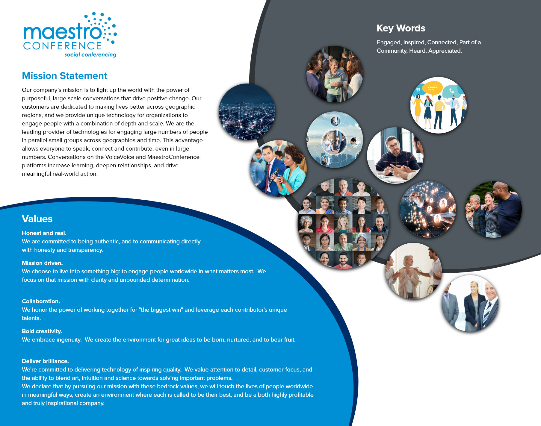
Before we defined the style guide, we wanted to get a feel for the flavor of the site. Our goal was to align our design with the chore values of Maestro Conference. We requested and carefully read through the company’s mission statement, values and asked them to provide keywords that would describe how they wanted to be perceived by their customers. We chose colors that are consistent with Maestro Conference’s brand colors and images which are reflective of their mission statement, values, and keywords.
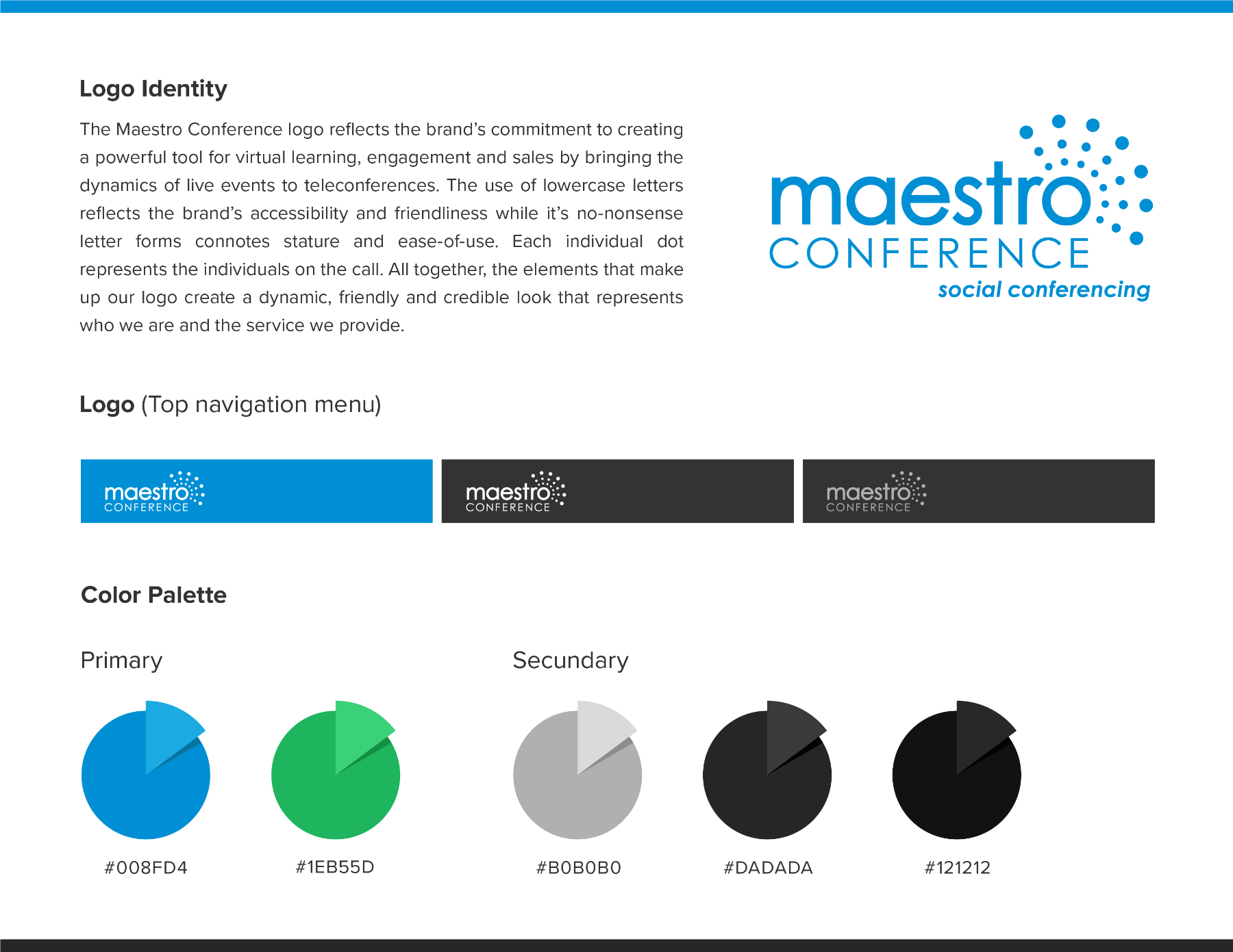
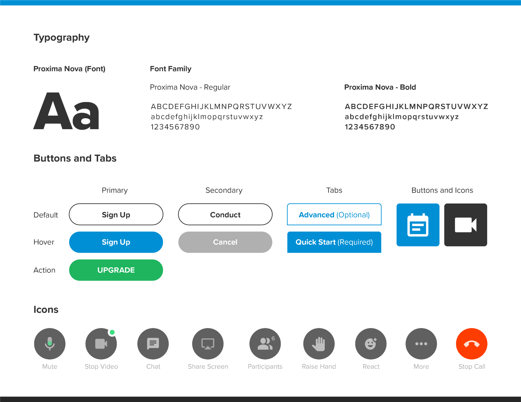
Style Guide
Tools: Adobe Photoshop
The style guide was created following Maestro Conferences brand guidelines. Part of the goal was to create a more up-to-date UI.
We chose the Proxima Nova font family because of its
- Modern look
- Variety of weights and styles.
- Popularity among websites across the globe.
- Font recognition across platforms.
We stayed with Maestro Conference’s primary colors and added a few additional colors that would give the brand a better look. By balancing darker grey tones with vibrant blue and green primary colors, users experience a higher color contrast, which makes important actions easier to recognize and visually more appealing.
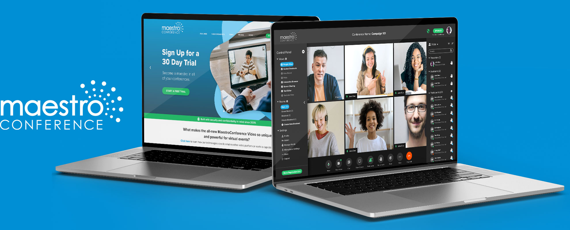
High Fidelity Mockups
Tools: Figma
Before we created the high-fidelity mockups, we met as a team to discuss the results from our wireframe user testing sessions and determine how our design iterations could be improved. With the mood board and style guides completed, we were in a good position to begin creating the high-fidelity mockups.
The greatest challenge we experienced during this stage was staying true to material design standards and using the correct button and tab states, which would allow users to intuitively navigate through the onboarding experience with ease.
Check out our Maestro Conference prototype.
Features & Characteristics
Tools: Adobe Photoshop
Tools: Adobe Photoshop
Design Insights & Challenges
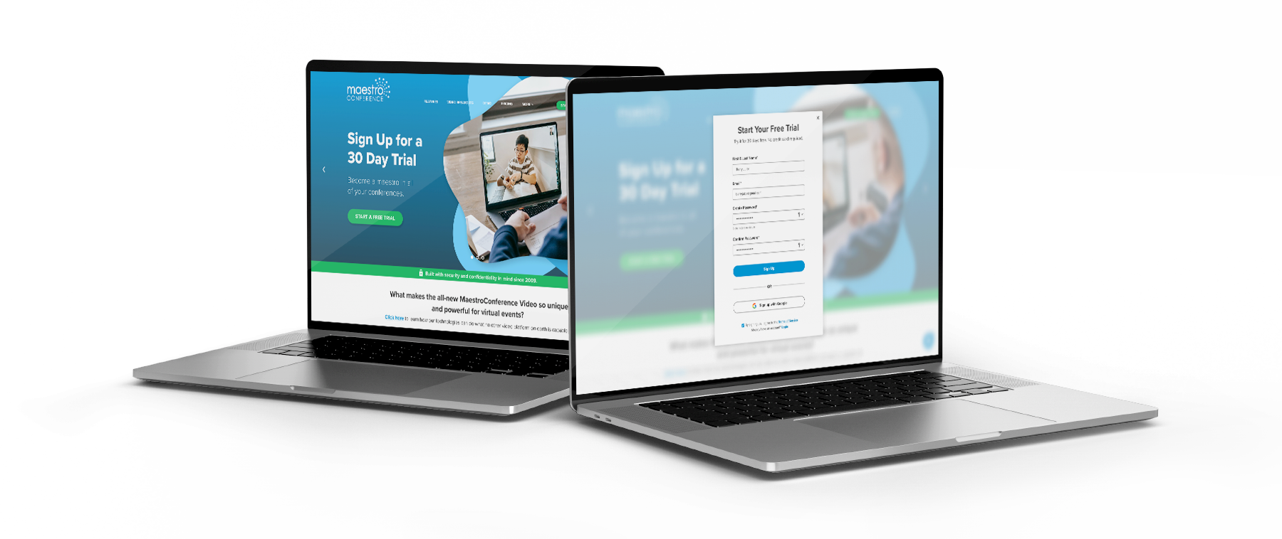
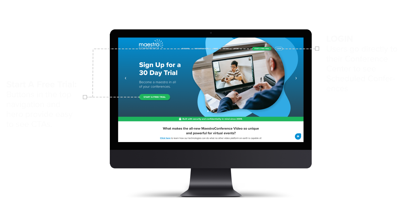
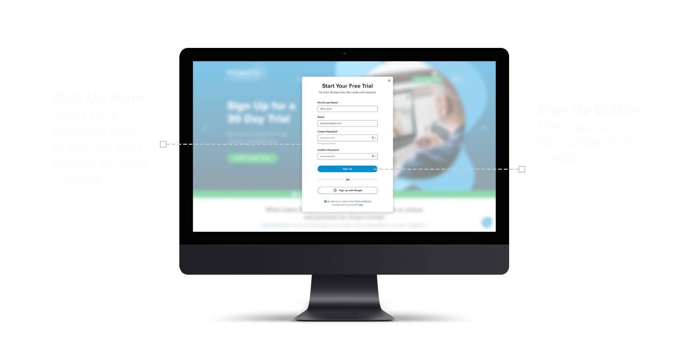
We designed the home page to align with Maestro Conferences’ current experience, by using similar colors and images. The onboarding process needed to begin with very clear indicators so that users would easily know where to sign up. A standard Start a Free Trial button in the top navigation and hero image makes signing up obvious.
Users are directed to a standard sign-up overlay window, where they can enter their login information or click the sign-up with Google button for a faster experience.
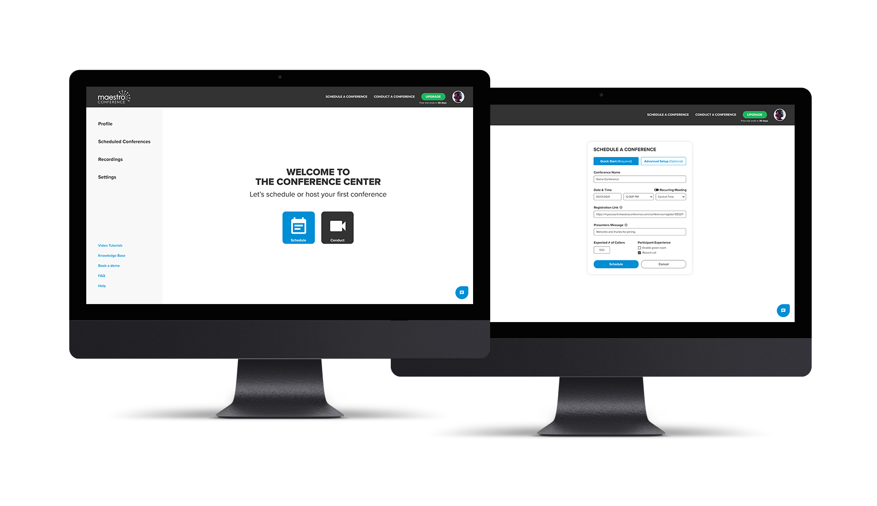
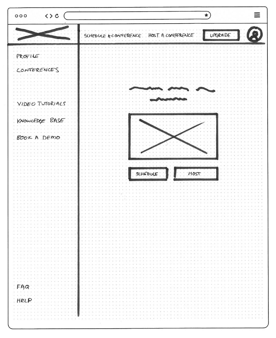
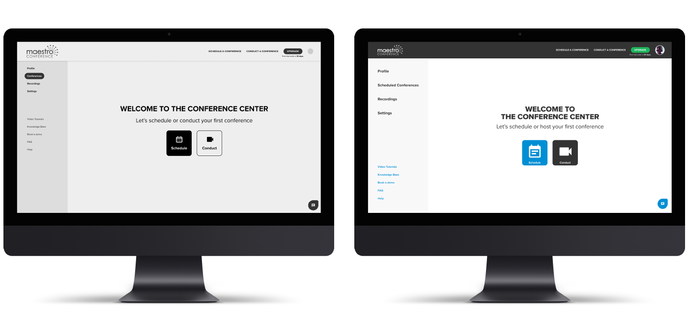
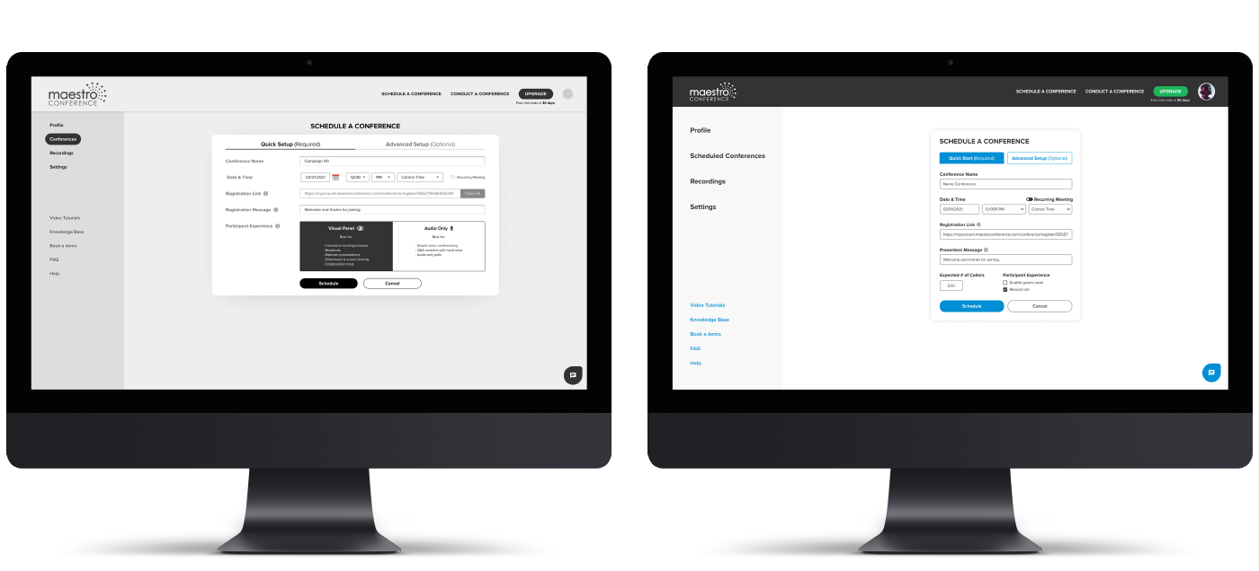
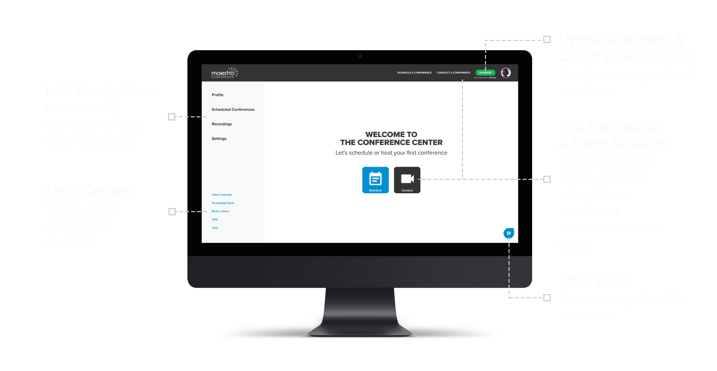
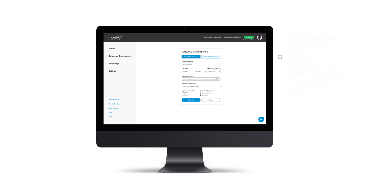
Our goal was to simplify the onboarding experience. We decided to adopt a similar design used by Zoom and Microsoft Teams by creating a Conference Center. From this location, users can access all of Maestro Conference’s platforms. Simple and clear instructions in the main body and top navigation links help users schedule or conduct a conference.
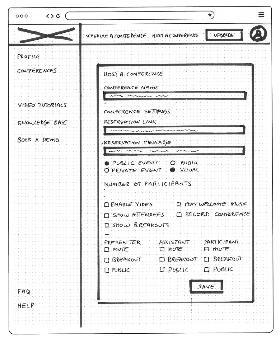
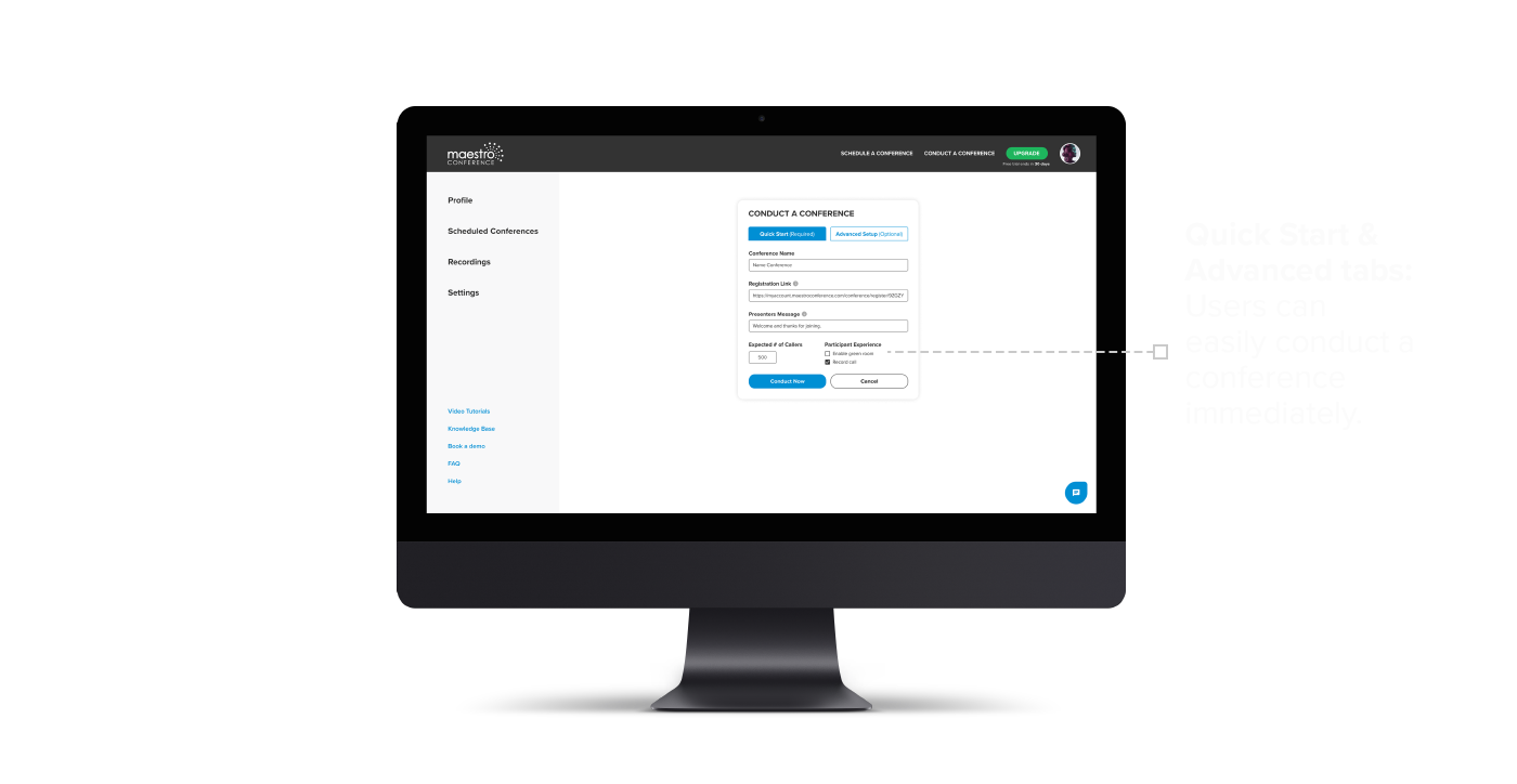
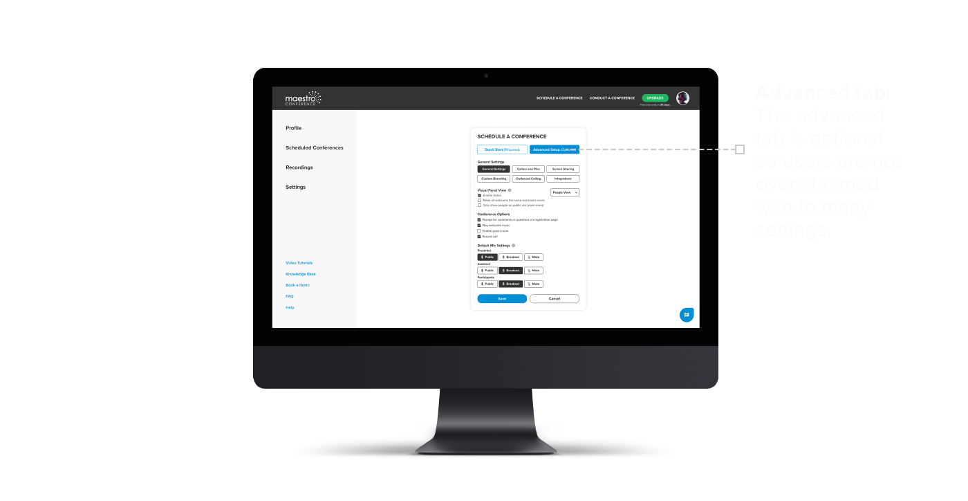
Scheduling a conference needed to be intuitive. To do this, we included only required fields with activated default settings to reduce the number of options users need to input. Advanced settings are optional and designed to provide additional user functionality without overwhelming the user. The blue Schedule button at the bottom of the form lets users know where to go once the settings are complete.
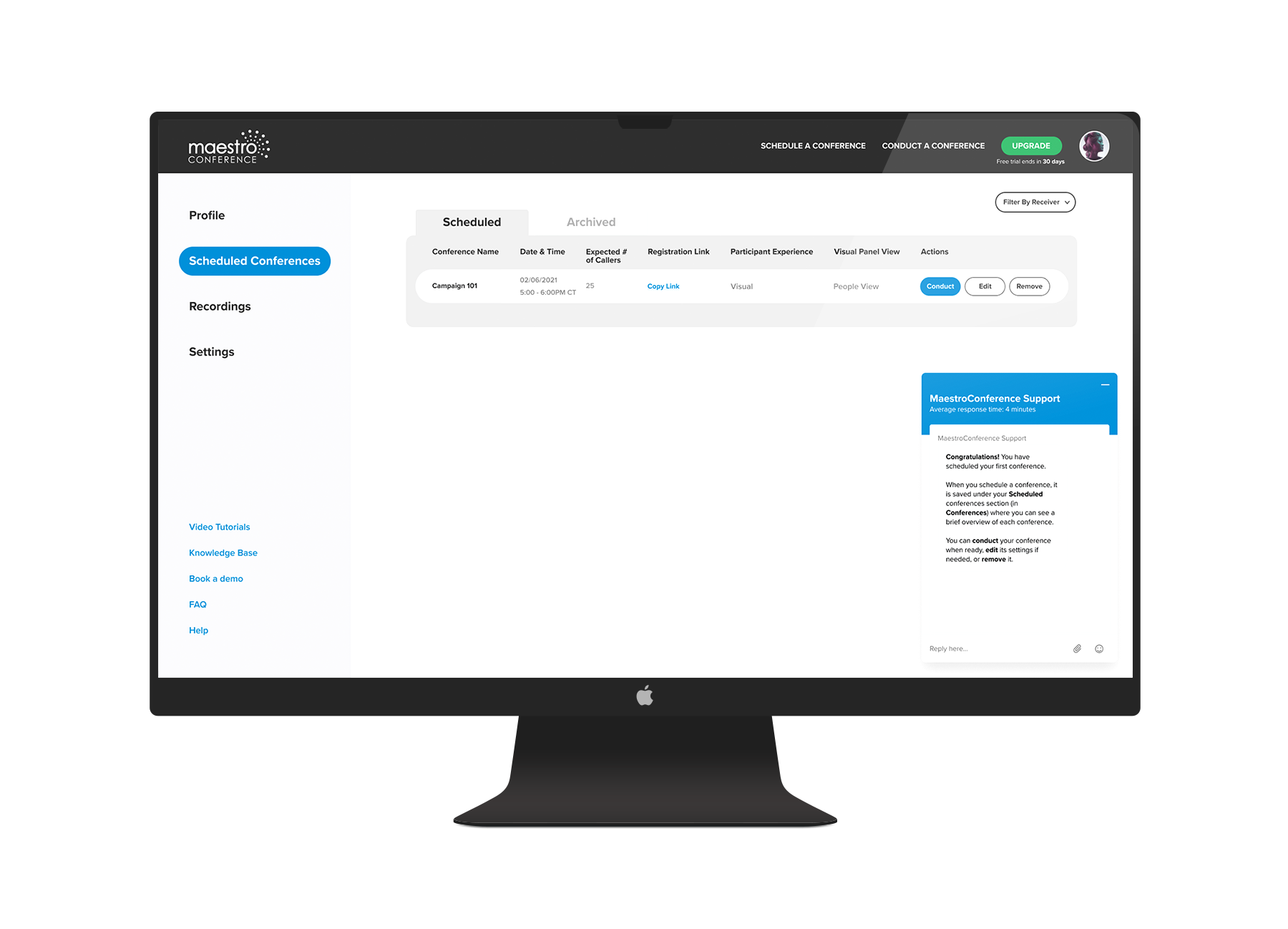
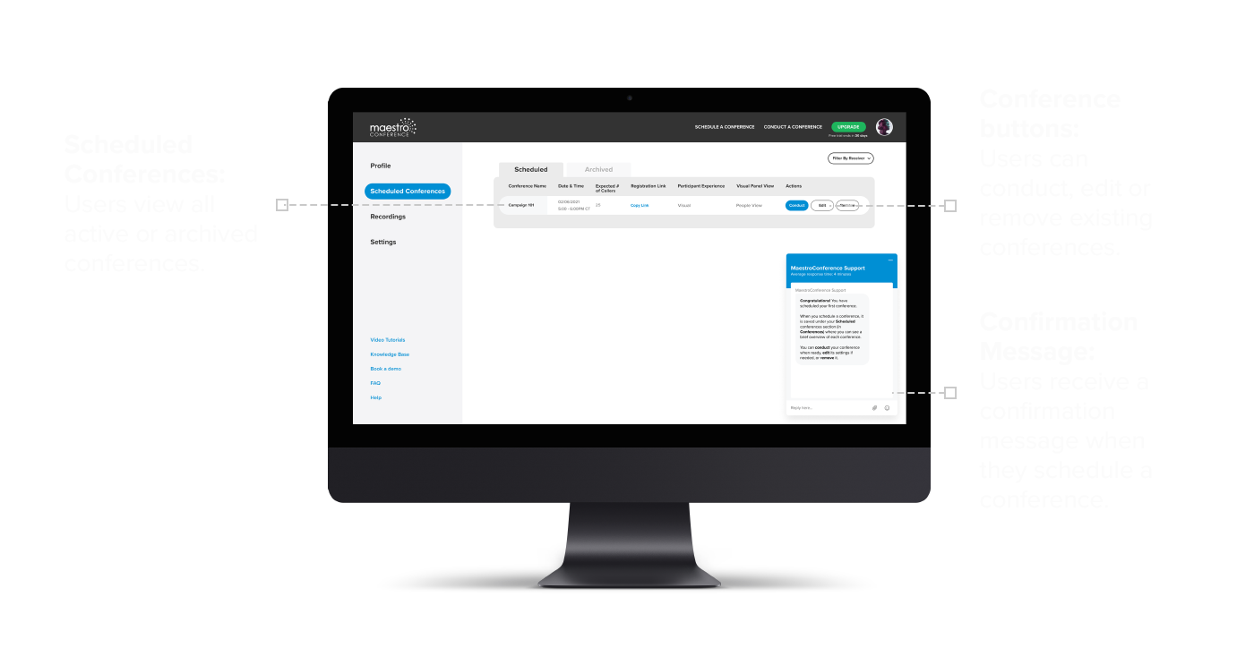
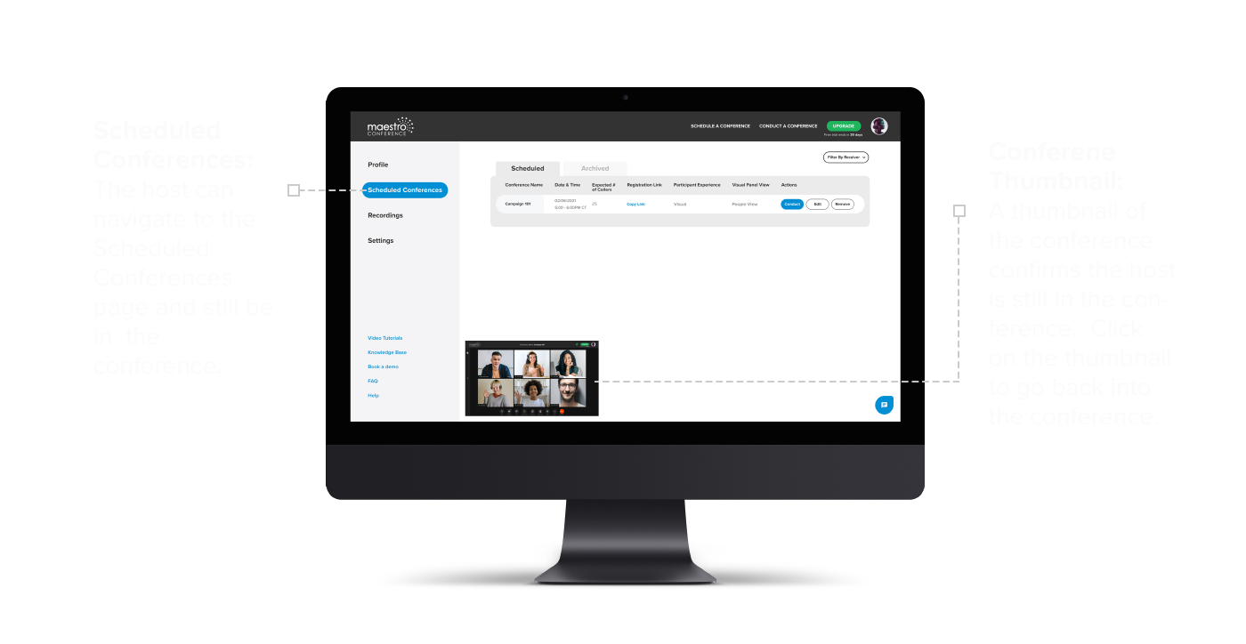
One of the challenges we had while designing the onboarding experience was making it easy for users to manage scheduled conferences. As the design evolved we saw the need for a Scheduled Conferences tab which became the default screen users are taken to once they log in.
Once a conference is scheduled, users are taken to the Scheduled Conferences page. A confirmation message in the main window assures users that their conference was scheduled successfully. Additionally, users see a list of their scheduled conferences, with options to edit or delete a conference. When a user is ready to begin a conference, users select the Conduct button and are directed to the Video & Audio page.
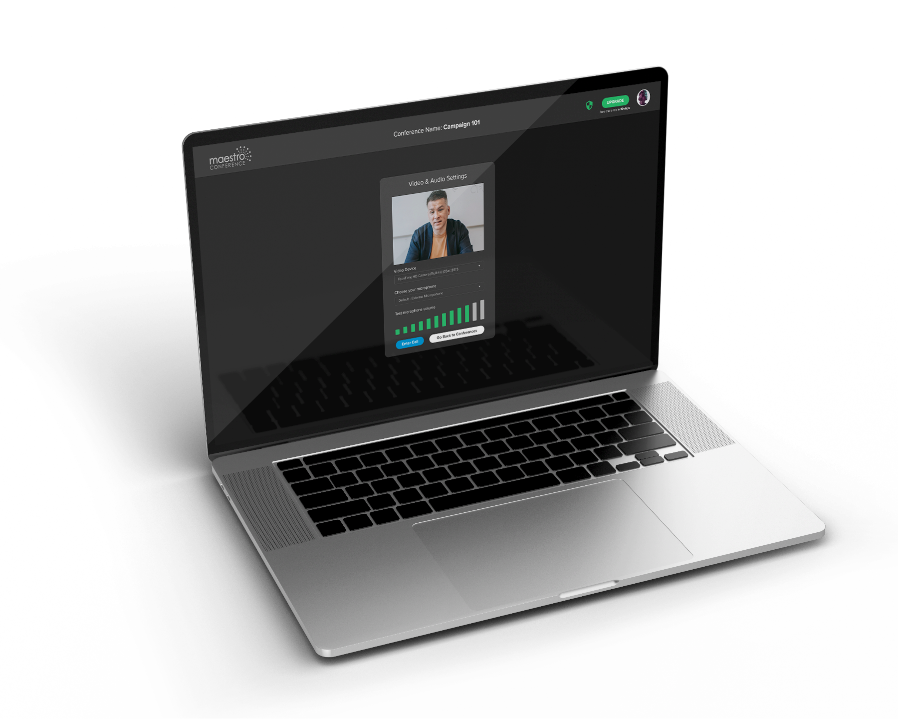
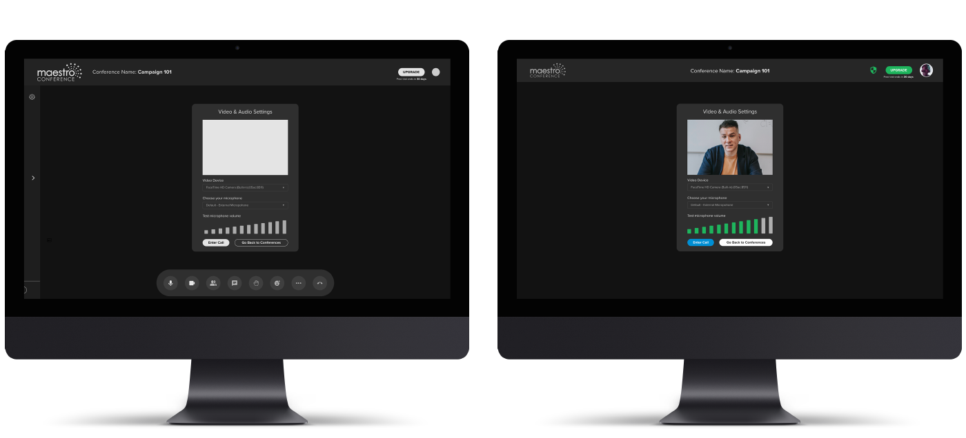
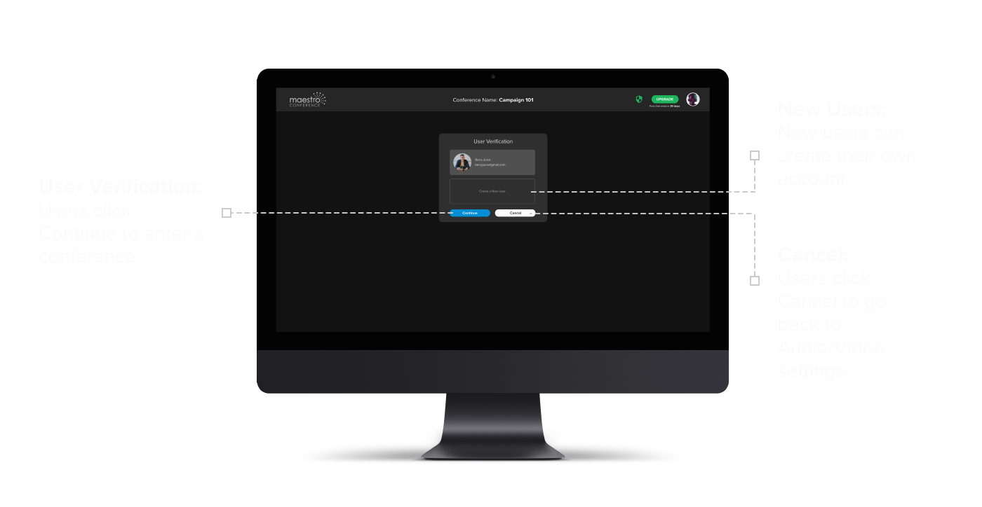
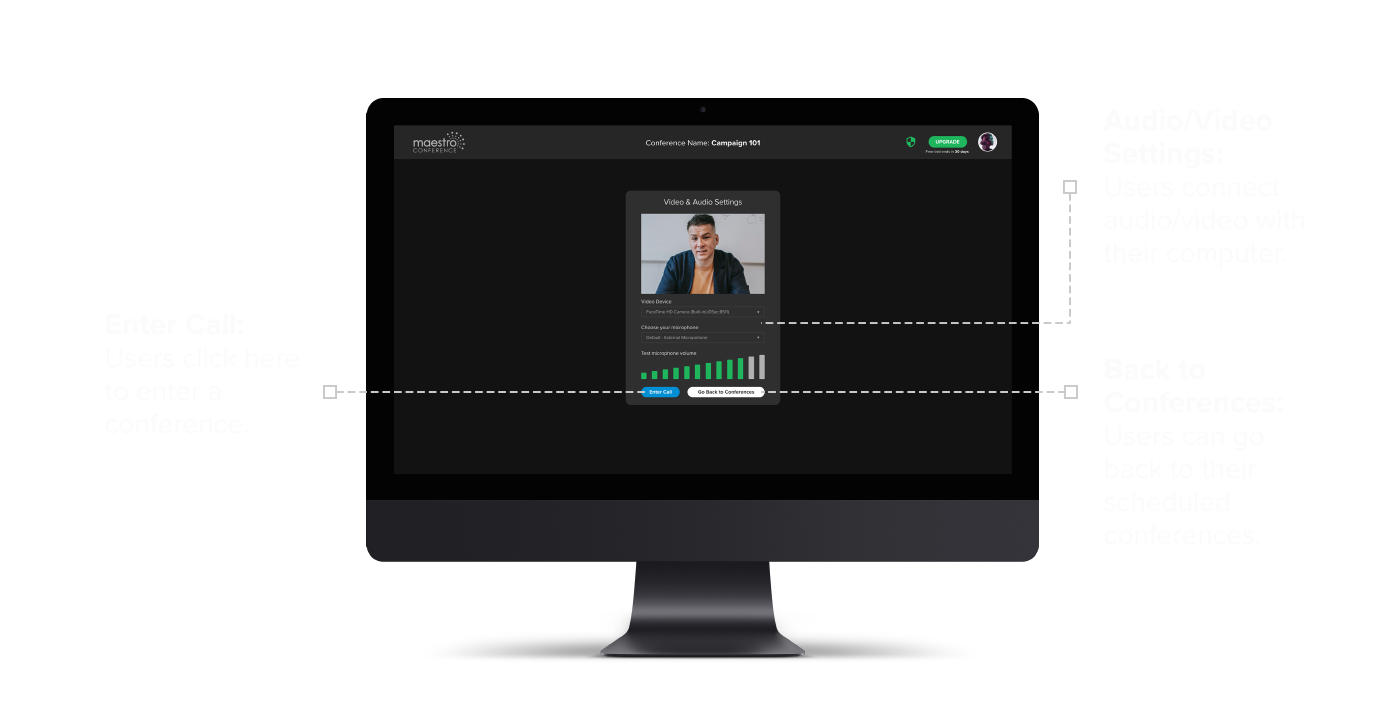
Another challenge we faced was improving Maestro Conference’s existing onboarding setup. Currently, when users create a conference, they must manage the audio and video settings separately. This process was very confusing and required a lot of customer support. To simplify and streamline this experience, we designed both audio & video settings to be managed on the same screen. This screen allows users to connect to and test both audio and video from their computer before they enter the conference. Users select the blue button Enter Call to enter the conference.
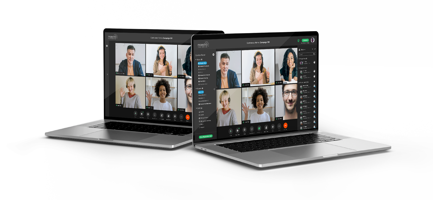
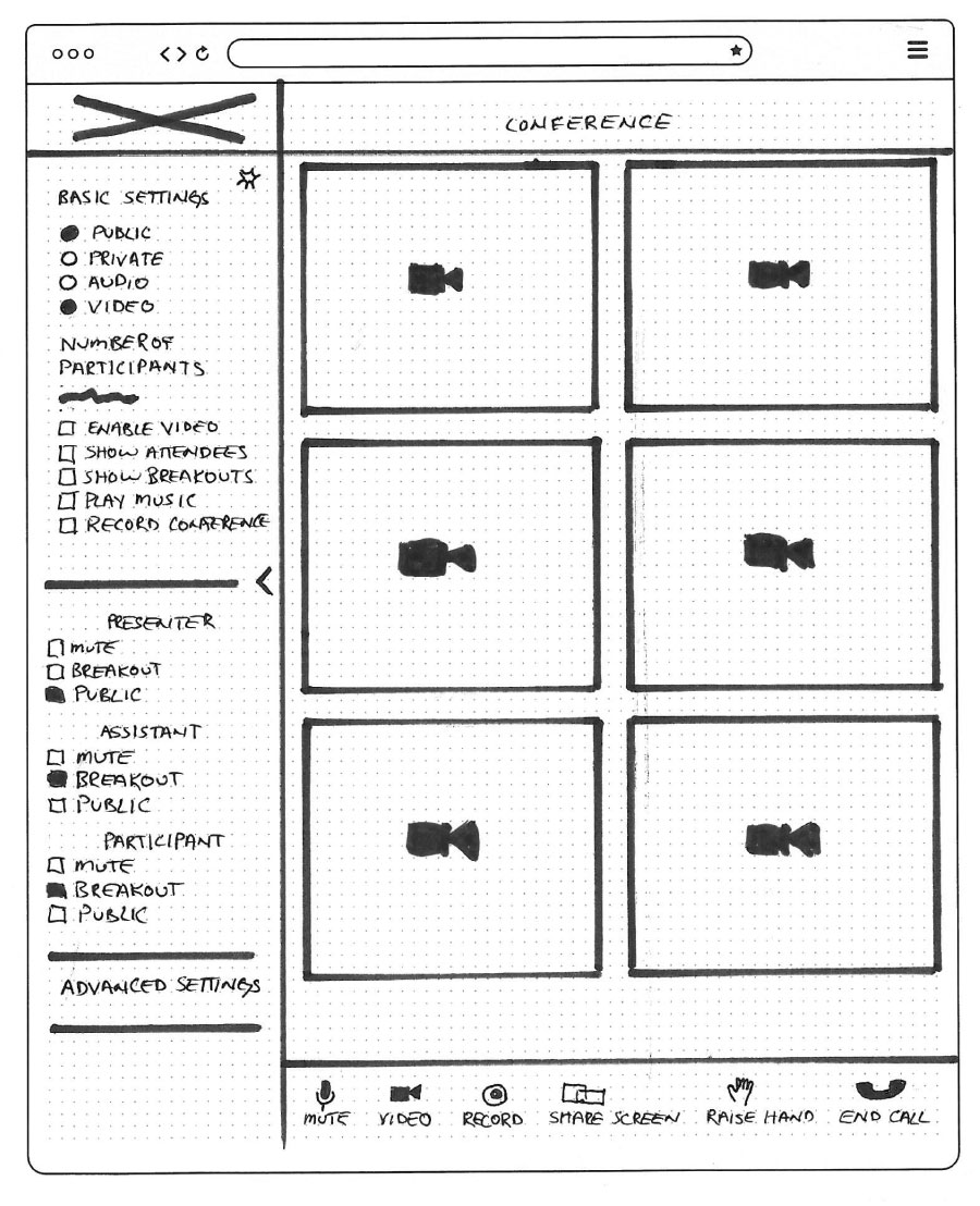
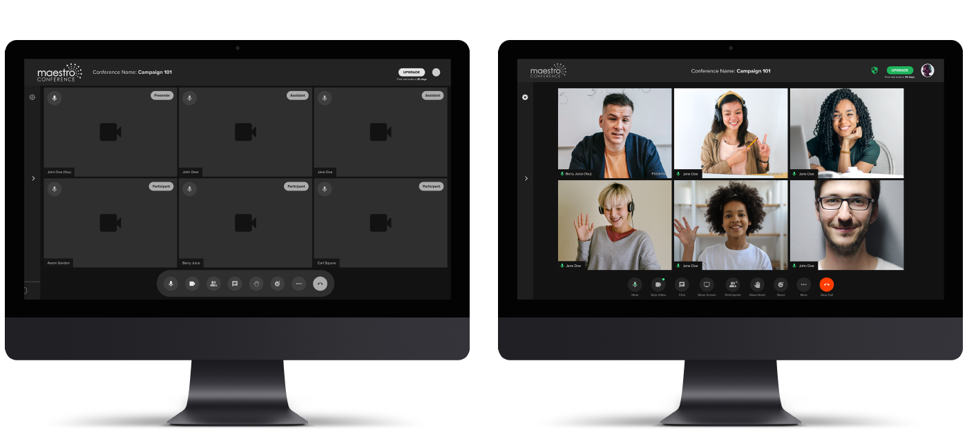
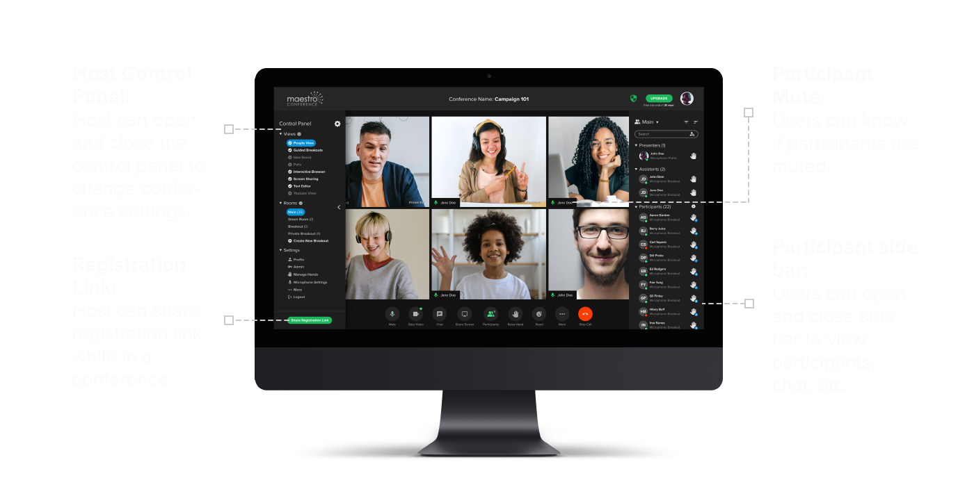
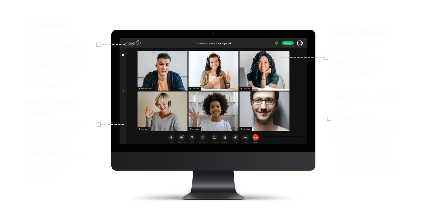
We had another issue that needed to be resolved. Maestro Conference’s current setup requires the host to navigate through three browser tabs to manage the audio, video, and host settings. We designed the conference experience to allow the host to manage all settings from within the video conference display by creating a Host Control Panel on the left side of the conference screen. To create a better host experience, we created a slider bar that opens and closes the host control panel. This design allows the host to easily manage conference controls without ever leaving the conference.
Additionally, on the right side of the screen users can manage conference settings by selecting from the toolbar at the bottom of the conference display screen. We decided to use standard icons and controls to make the conference experience more familiar.
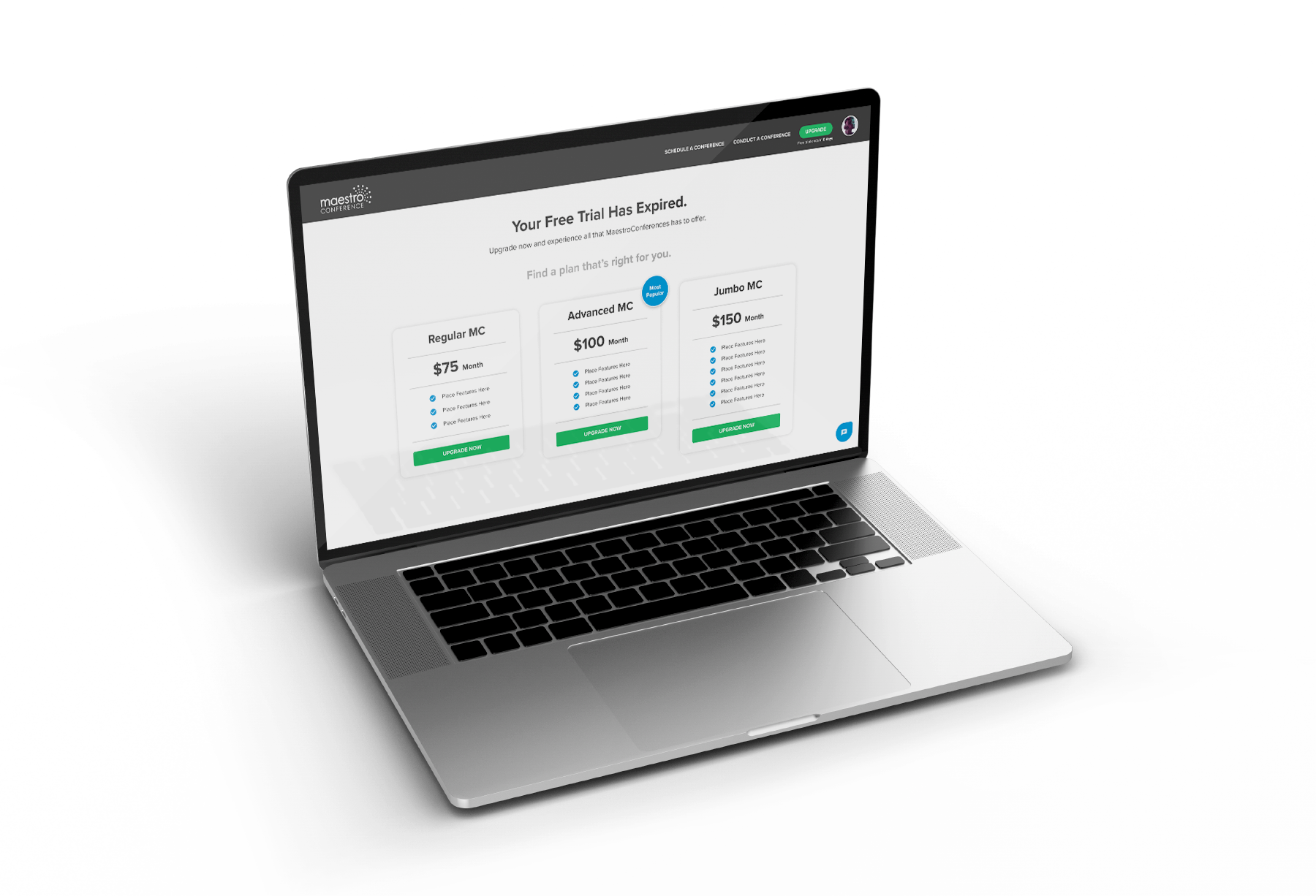
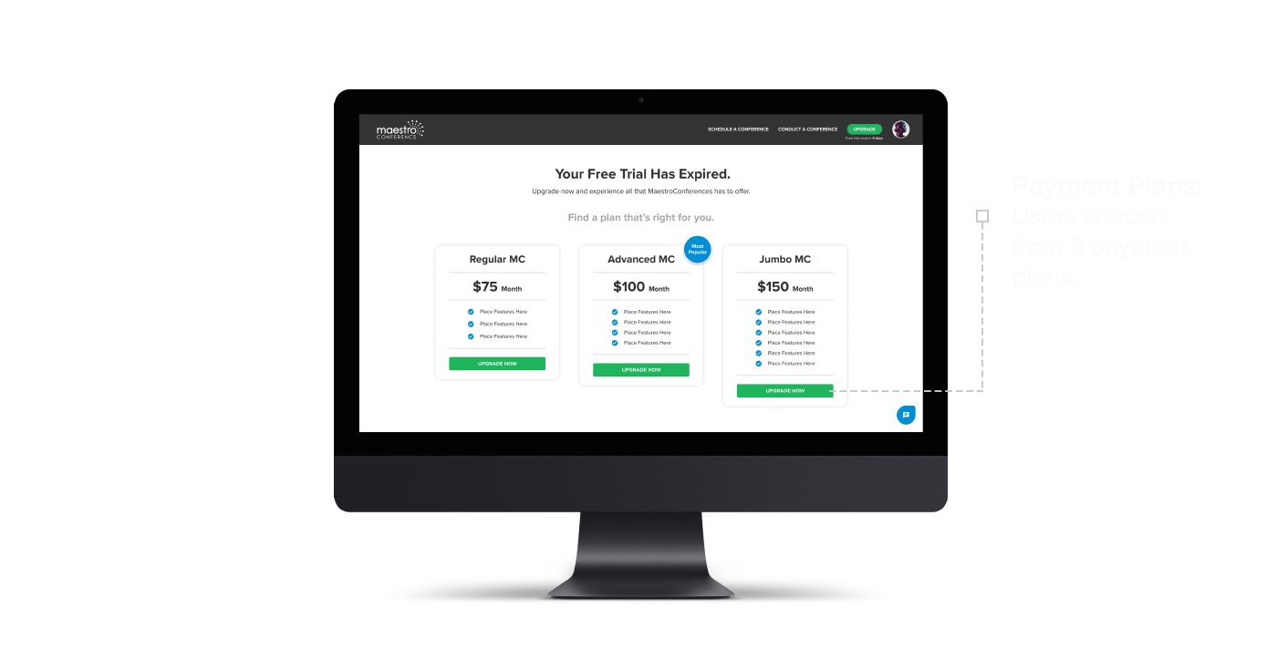
The final challenge we had was when we would introduce a payment option in the onboarding experience. Currently, users are required to provide credit card information at the beginning of the onboarding process. However, asking for a credit card before users have decided if they want to use the platform creates an unwanted jump-off point. To satisfy both users and the company, we designed an Upgrade button with a free trial countdown clock, which shows throughout the entire free trial period. Users can upgrade at any time during their free trial. When the free trial period expires, users must select from one of the payment plans to keep using Maestro Conference.
When the high-fidelity mockups were completed and prototyped, we presented the finished prototype to the heads of Maestro Conference. Their feedback allowed us to implement some design updates that we did not know of before which allowed us not only to meet the needs of our users but the needs of the company as well. Judging by the positive feedback we received from Maestro Conference, we felt that we had succeeded in designing an onboarding experience that simplified the process for users and satisfied the needs of the company also.

Redesigning Maestro Conference’s onboarding process has been a rewarding experience. The greatest challenge was learning to think simply, not overcomplicating the process while satisfying the companies requirements. I have learned that a happy company/user relationship happens when users are at the center of the design. There is an old saying, “When mama ain’t happy, ain’t nobody happy”. In the UX world that saying could be translated, “When users ain’t happy, ain’t nobody happy.”
Working with a team of talented UX designers has taught me the value of the individual contribution, combined with the synergy a team brings to developing a project. I have come to learn not only to appreciate but to celebrate the fact that each person is unique and that splendid uniqueness brings with it a different way of viewing the world. It is this unique perspective that drives disruptive design.
This project has given me a greater appreciation for leading in your strengths and providing support to other team members in their strengths. I have seen the value of collaboration and the importance of not letting the ego get in the way of good design. In short, good design is not what users see, but what users don’t have to see.

The Maestro Conference platform is about bringing people together in meaningful interactions. Our goal was to simplify the onboarding process so that users could more easily engage with one another. By creating a user-friendly design that reduced the number of onboarding steps from 18 to 6, and based upon positive user feedback, I think we accomplished that goal.
While we have made great strides toward creating a better onboarding experience, there is still much work that needs to be done to improve the “in conference” experience. Further designs should include:
- Rethinking the host control panel and enabling the host to more easily control conference settings.
- Redesigning the conference video frames to highlight the presenter while showing as many conference participants as possible in the video view.
- Increasing the participant functionalities to provide greater user controls. (eg. Screen Share, File share, Mute, Unmute, etc.)
Developing these three phases are essential next steps to creating a seamless user experience from beginning to end and will create happy long-term users.
