

THE PROBLEM
HomeBody fitness is an app that helps people with catered home workout programs, solving a need for millions of users worldwide. My biggest challenge was creating an app that would translate the gym workout experience in a home environment which encourages commitment and provides the accountability users need to get the results they want.
THE SOLUTION
I conducted a 5-day “Google Ventures’ Design Sprint”, which provided the structure for a quick design-build, beginning with user research and finishing with a fully functional prototype which users tested to determine if our design was moving in the right direction.
MY ROLE
I worked as the lead designer on every phase of the project beginning with user research and through every iteration of the product’s development.
DAY 1
MAPPING
USER RESEARCH
I began the design sprint by researching what our users were looking for in a home workout experience. I conducted interviews with demographically targeted individuals who provided valuable insights. From these interviews, I began to see patterns and trends emerge. Here is what people said,
I’m new to doing home workouts. I have my routine at the gym, but I don’t know how to translate that into what I am doing at home.
Amber Jones
“I’m trying to stay consistent – working out at home may be more convenient, but its not the same as going out for a run or to the gym. I really need a way to stay motivated to keep up with it when it can be so tempting to just relax on the couch”
Robert Kline
I have a few weights at home, but not nearly as many as there are at the gym. If I can maximize what I can do with those weights, it would really help me workout from home.
Tim Martin
HOW MIGHT WE…
Using the information I gathered from the user research, I performed a brainstorming session in which I wrote down all the how might we statements that could provide solutions to the problem space. I then reviewed and prioritized them to focus the design into a most viable project (MVP). I decided to build the app as an answer to these questions.
How might we translate a gym routine to a home workout?
How might we cater home workouts to the user?
How might we help users be consistent in their home workout program?
USER STORIES
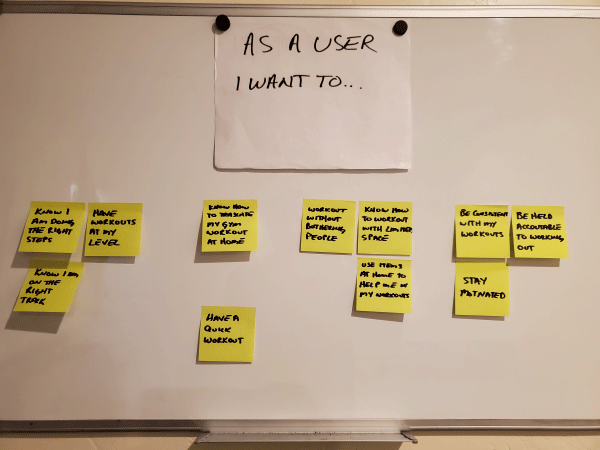
At this point, I had a strong foundation to synthesize the information into themes and insights, from which I developed user stories. These user stories were written on notepads and grouped into themes.
MAPPING A USER FLOW
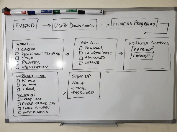
As part of the design sprint, I mapped out a user flow by drawing a rough sketch on a dry erase board. The purpose of this exercise was to get a general idea of the path a user would follow to achieve their home workout goals.
DAY 2
SKETCHING
LIGHTENING DEMOS
Before I jumped into sketching, I conducted lightning demos with 5 home fitness apps by searching in my “Google Play” app store. I chose the following apps because of their high ratings (4.8 – 4.9 stars): “FitOn”, “Home Workout”, “Home Workout For Men”, “Female Fitness Workout”, and “Lose Weight in 30 Days”. I gained a lot of inspiration from the FitOn app, which provides a much more personal experience than the other apps. While there were many features that I liked in the app, there were some that I didn’t, which encouraged me to think of how I would improve the design. This exercise stimulated ideas and helped me in my sketching exercise.
FitOn
Home Workout For Men
CRAZY 8 SKETCHES
From the information I gathered, with the guidance of the user flow and the inspiration of the lightning demos, I used the “Crazy 8” method. I first sketched out 8 versions of a critical screen and then chose the one I thought was the best design. I created a simple tiny storyboard by sketching the screens before and after the critical screen.
Next, I sketched 8 variations of the onboarding user flow to brainstorm different onboarding experiences.


Each of the sketches I created had certain advantages. This exercise helped me design solutions to the problems users expressed about home workouts. It also allowed me to see that the user flows which catered workouts to the user’s interests, skills, and goals are the best user-centered design approach.
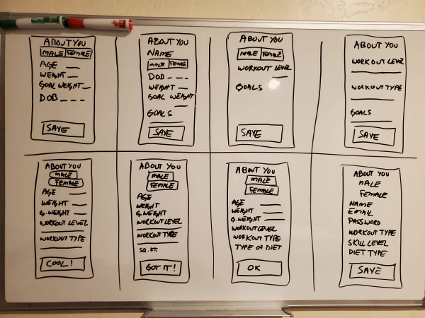
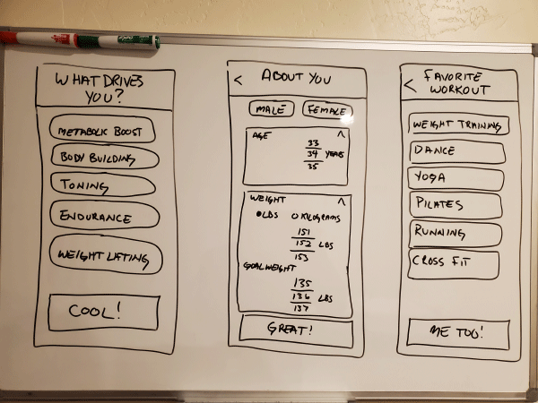
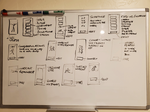
DAY 3
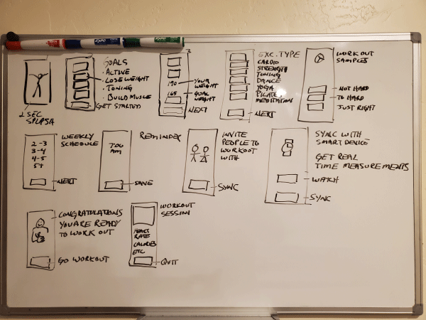
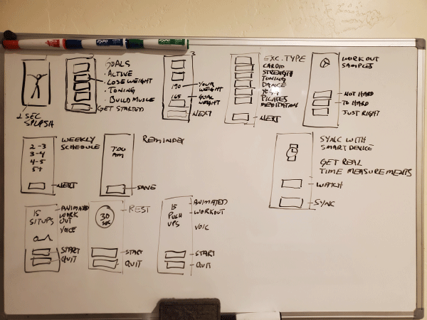
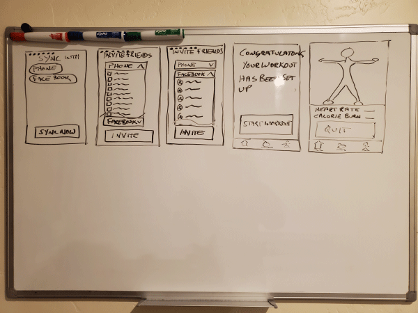
STORYBOARDING
Sketches provided the springboard for me to create a storyboard, which added greater detail to each screen. Day 3 began with reviewing the 8 different sketches I drew the day before and choosing the elements I liked out of each one. I chose a user flow that builds the workout into your calendar, has reminders, invites friends to join you in your workouts, and gives users the opportunity of working directly with a professional trainer. I thought this user flow represented the best user-centered design.
While the storyboards do not include all the fine points which would become part of the high fidelity mockup, they proved very helpful in providing the framework I needed for rapid prototyping.

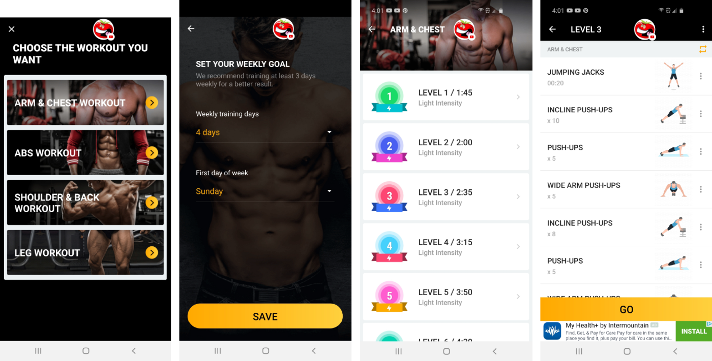
DAY 4
PROTOTYPING
Tools: InVision, Adobe Photoshop
This design sprint is about creating an onboarding experience for the “HomeBody Fitness” app. The work of days 1 – 3 made creating high-fidelity mockups a fun and creative experience.
Feel free to checkout the InVision HomeBody Fitness App Prototype.
Before beginning, I reviewed all the information I gathered in the design sprint. The user flow and storyboards were particularly helpful in providing a strong direction for prototyping.
FEATURES & CHARACTERISTICS
DESIGN INSIGHTS & CHALLENGES
Tools: Adobe Photoshop
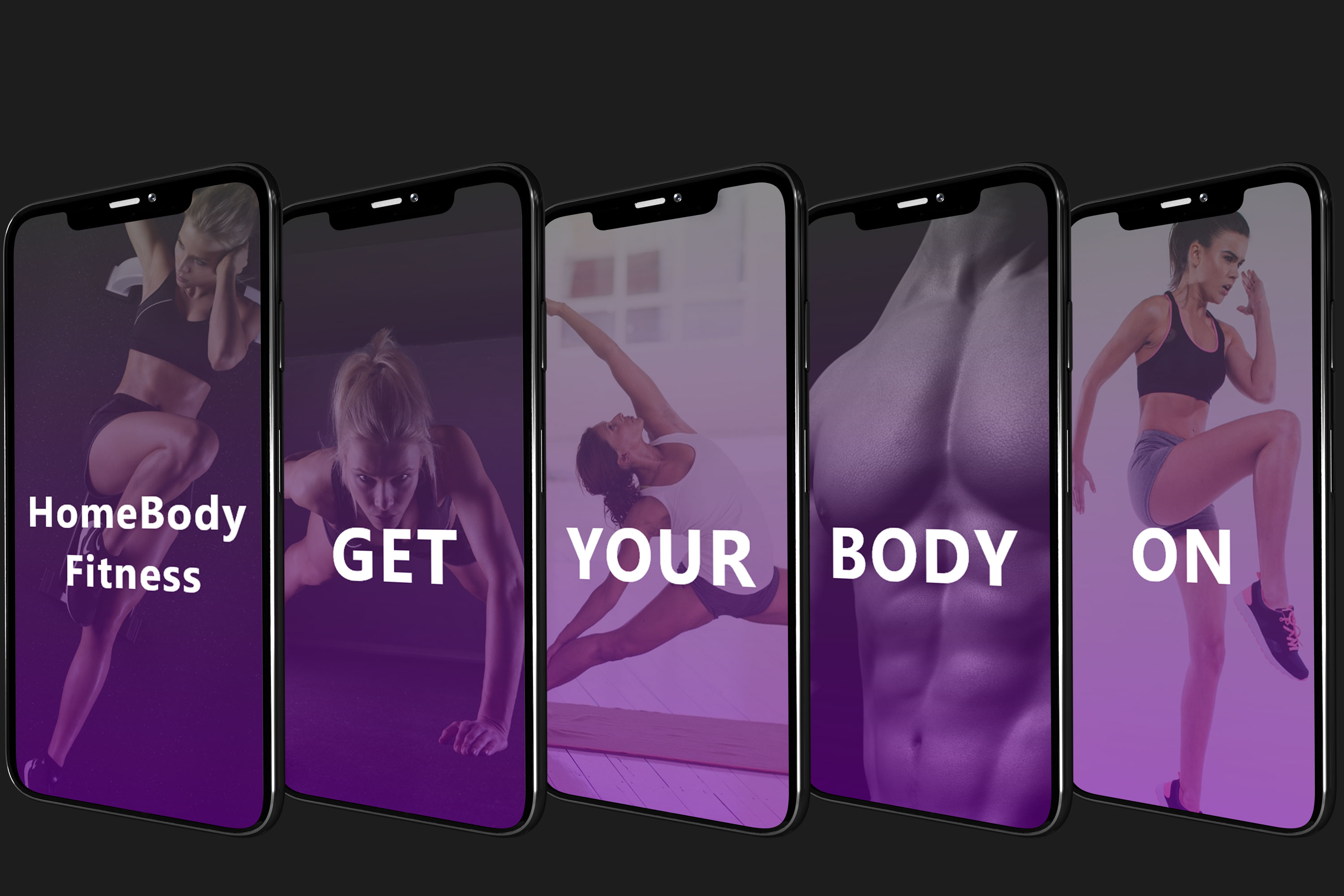
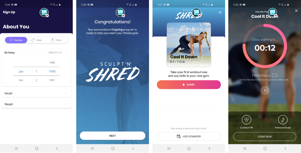
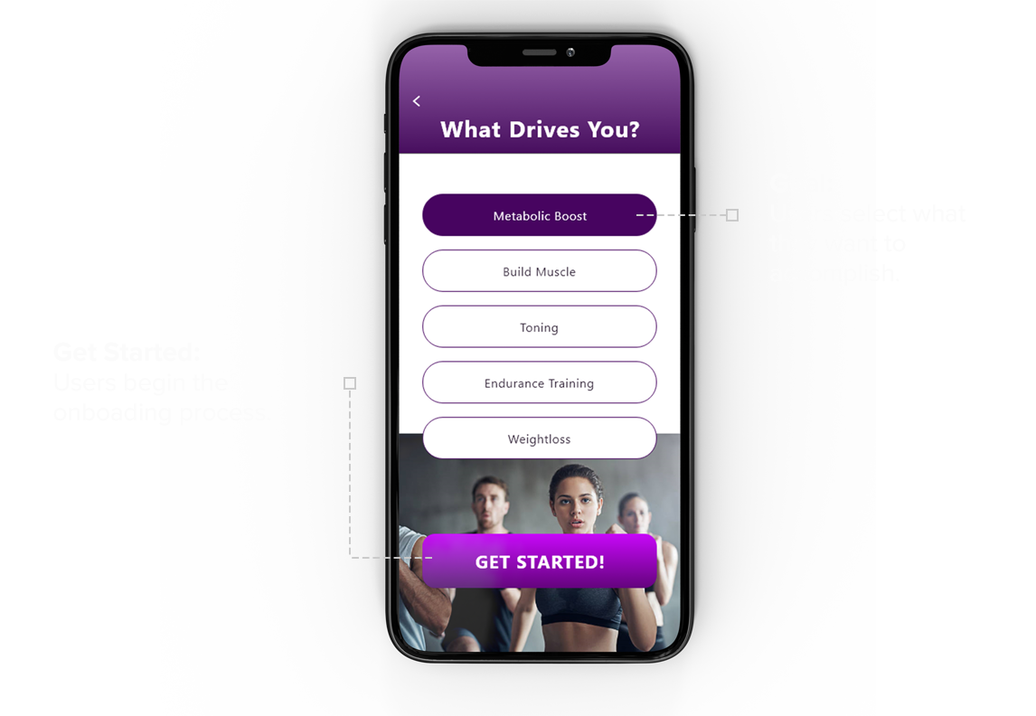
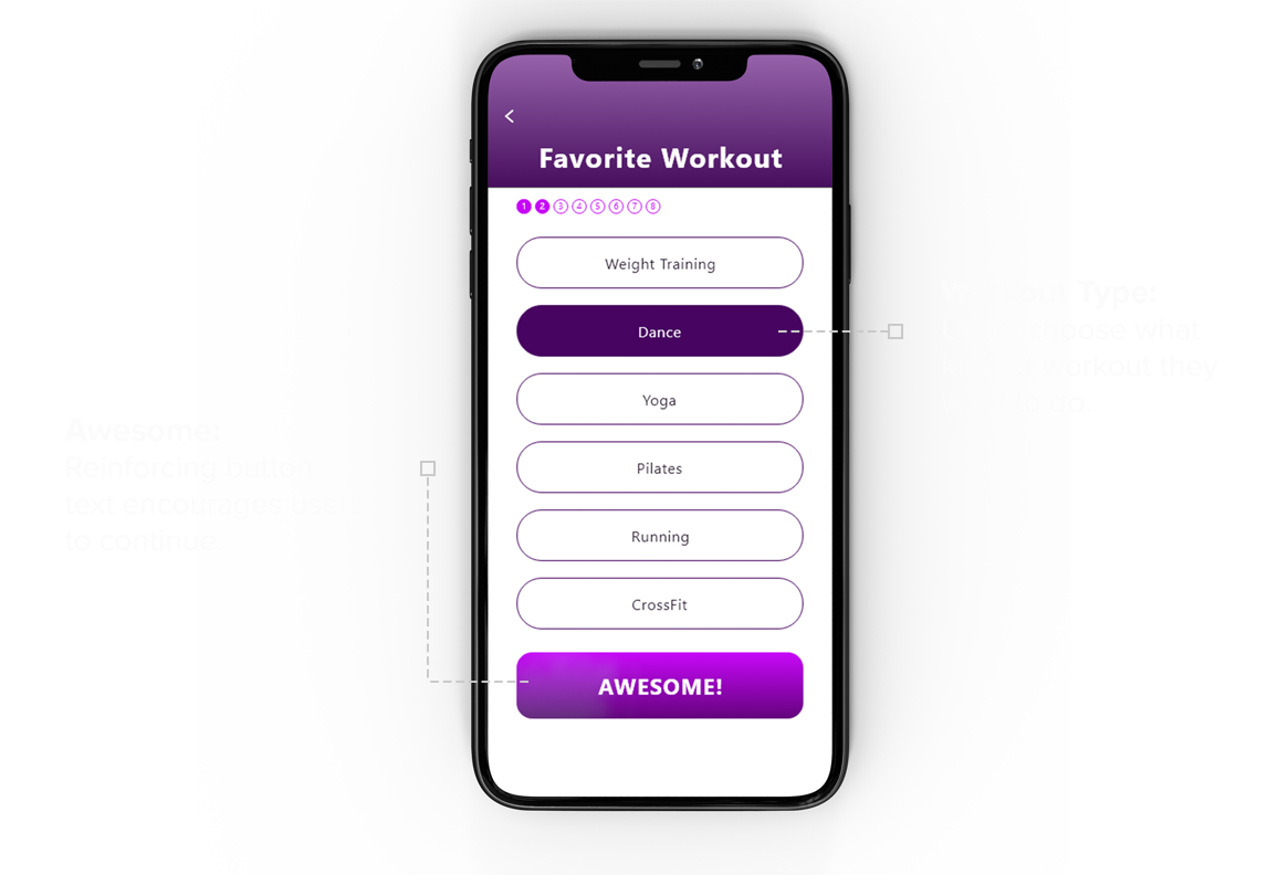
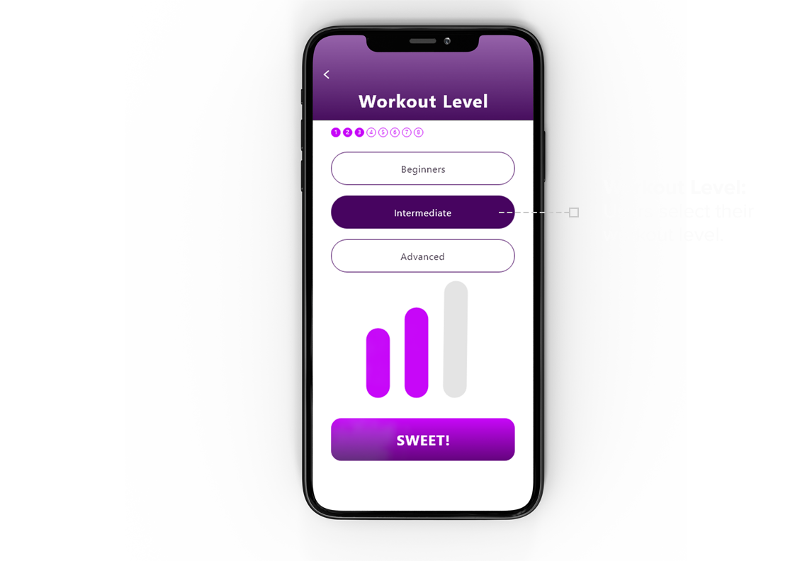
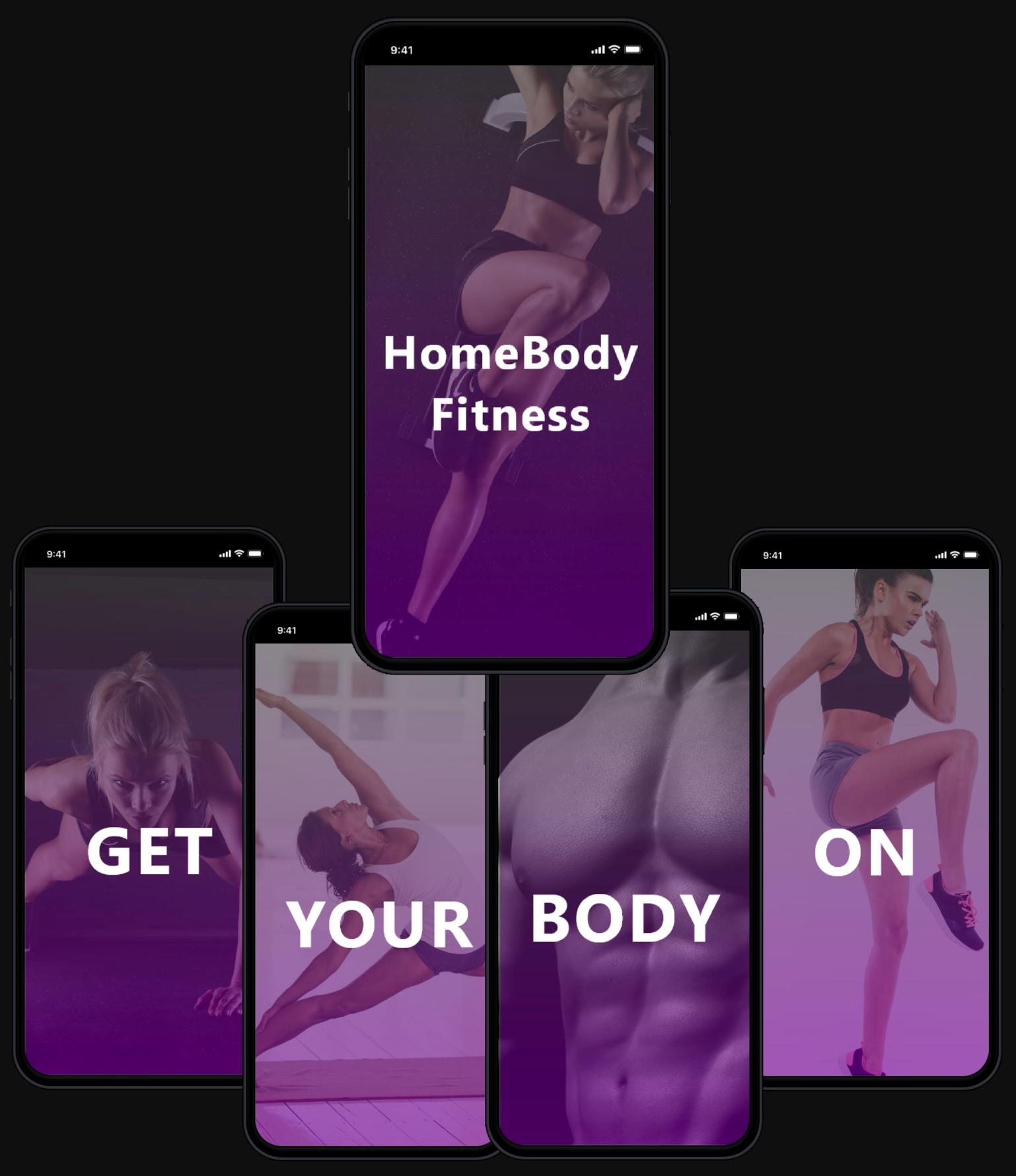
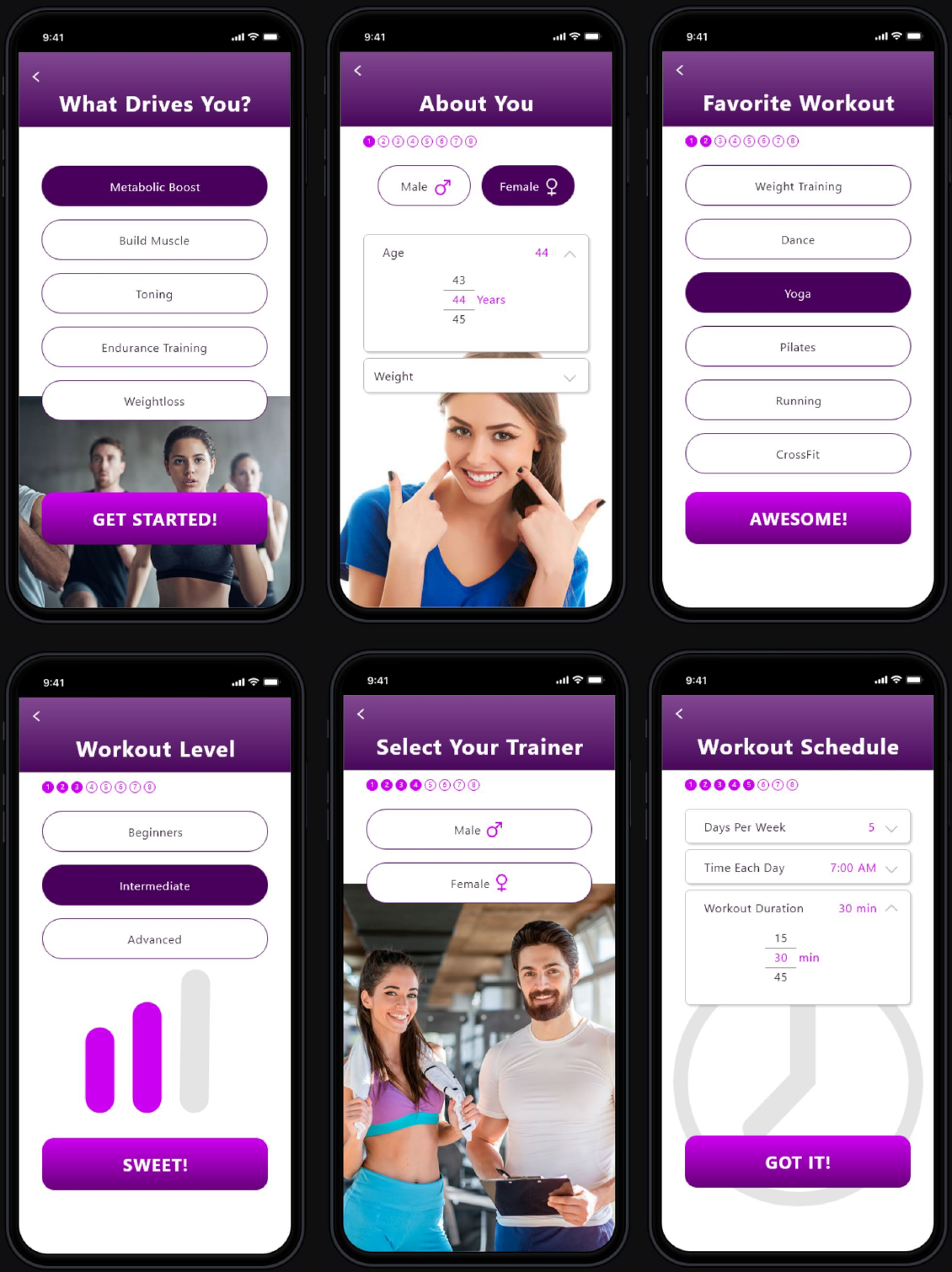
I decided the design needed an engaging introduction that would capture the user’s interest and encourage them to begin and complete their onboarding experience. For the prototype, I created a series of images that correspond with the slogan “GET YOUR BODY ON”, after which the app asks questions designed to identify what the users want and caters to a workout specific to their interests and skill level.
To appeal to a variety of users and increase the likeliness of them using the app, it would need to cater workouts to their interests and skill level. The onboarding experience asks leading questions, which identifies that interest and provides workouts based on the users’ skill level.
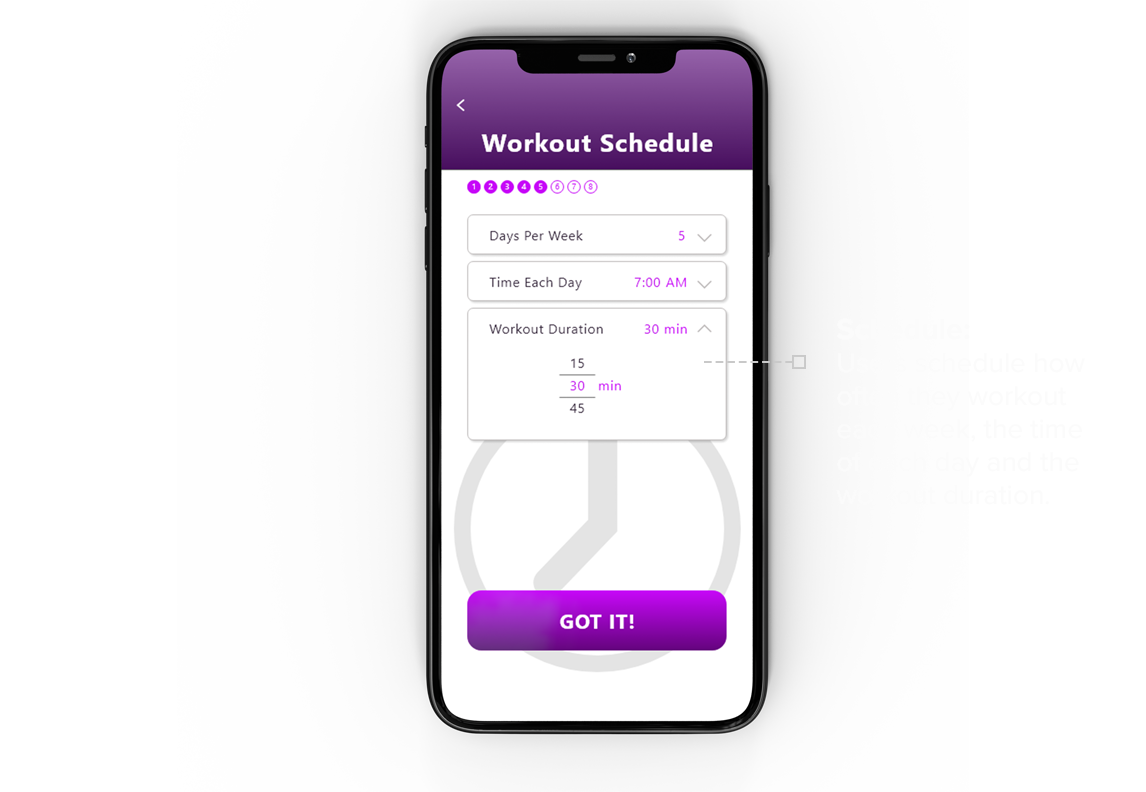
One of the challenges that people expressed during interviews was, “I want to be consistent with my workouts, and am concerned that when working out from home, I will find excuses, not to workout.” In my design, I asked, “How might we overcome that challenge?” This is answered in 2 ways:
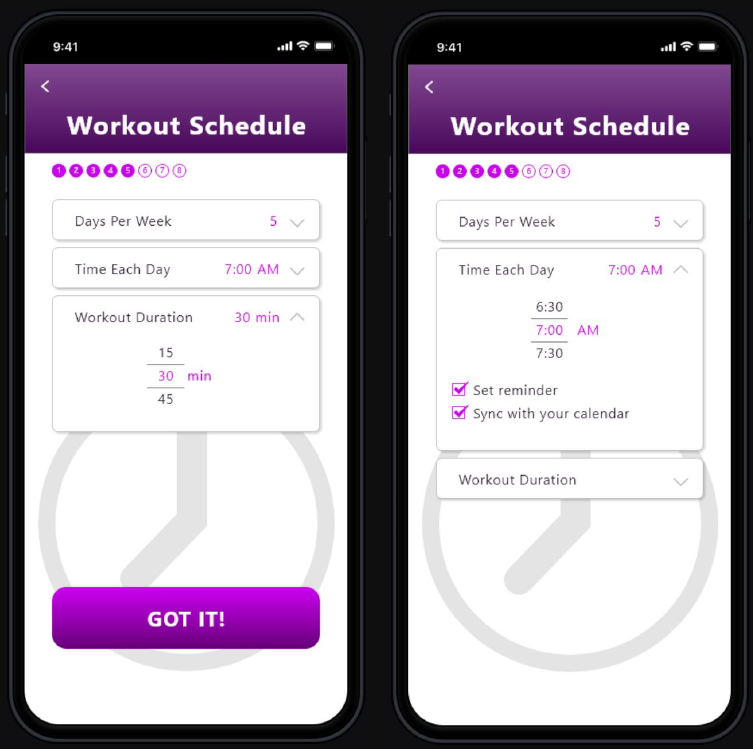
1 Reminders
Users are asked to schedule how many days each week they want to workout, the duration of their workouts, and the time they want to start. The app allows users to set an automatic reminder, which syncs with their phone’s calendar. The hypothesis of these features is: By setting a schedule and creating convenient reminders, users will be more likely to complete the task.
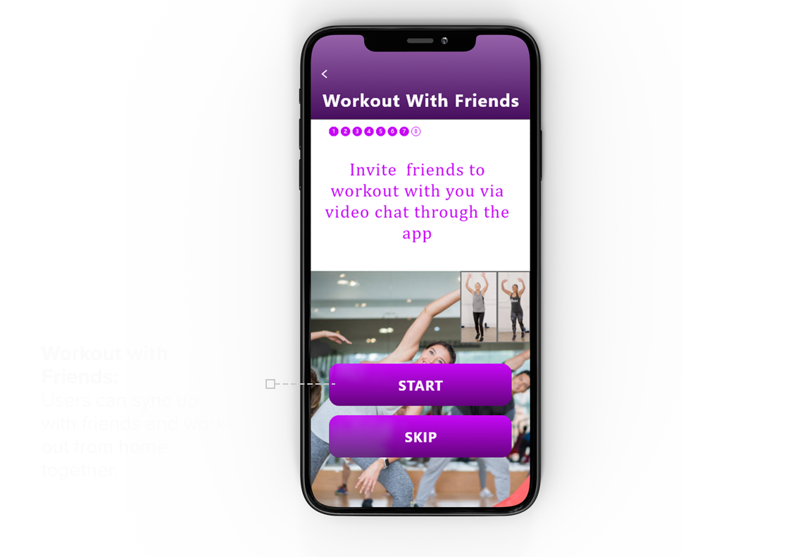
2 Accountability
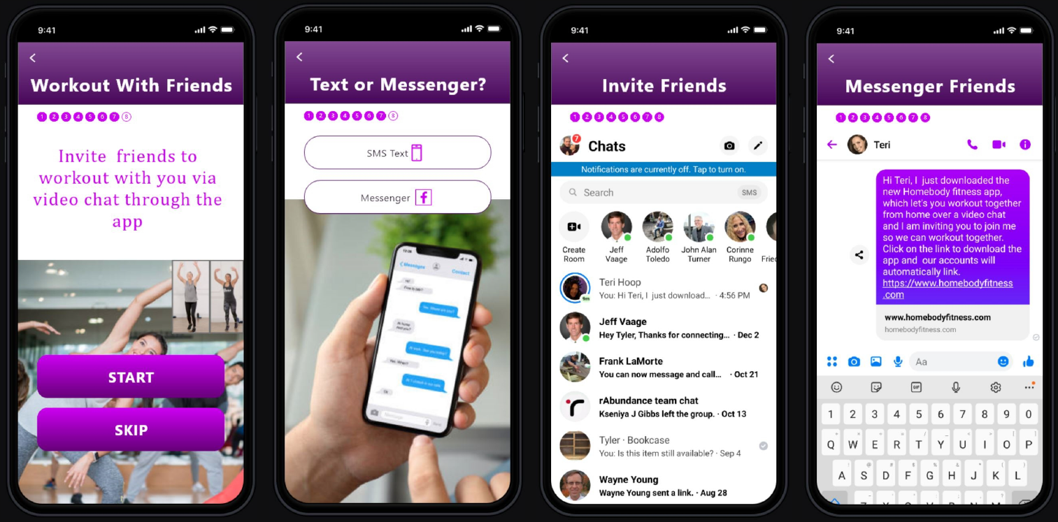
Being accountable to another person increases the likeliness of completing a task. But how would I design this into the app? I decided to incorporate 2 ways that increase the likeliness of users sticking to their workout goals.
Workout with friends
The onboarding process includes a social function that allows users to connect with their friends and invite them to join them in their workouts via a video chat. This function links two users and allows them to watch the same workout program and see each other in real-time. Users can talk with one another as though they are in the same room. The hypothesis is: Adding a function that allows friends to connect and work out together increases the users’ commitment and accountability, while the social element makes the workout more enjoyable. These things increase the likeliness of users reaching their goals.
Engaging a professional online trainer
Once users have completed the onboarding process, the main navigation shows an option for users to contract with a real online professional trainer. This feature encourages users to be consistent and provides professional tips, which helps users get the most out of their workouts.
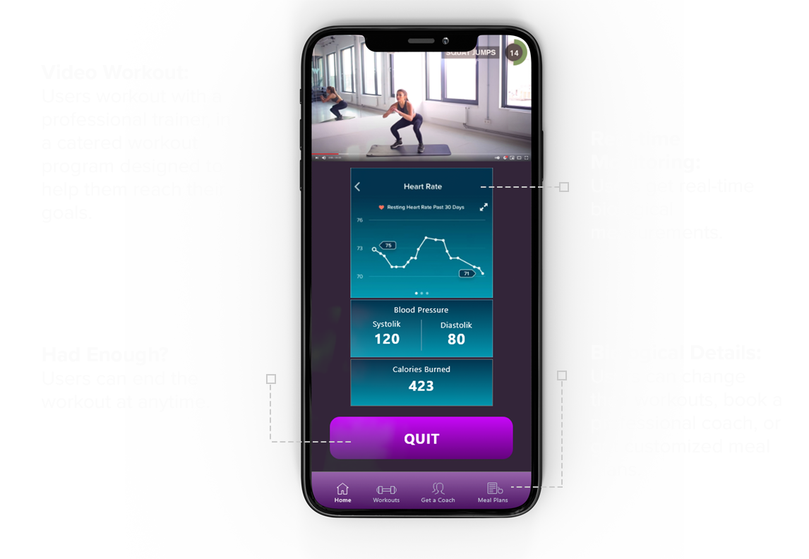
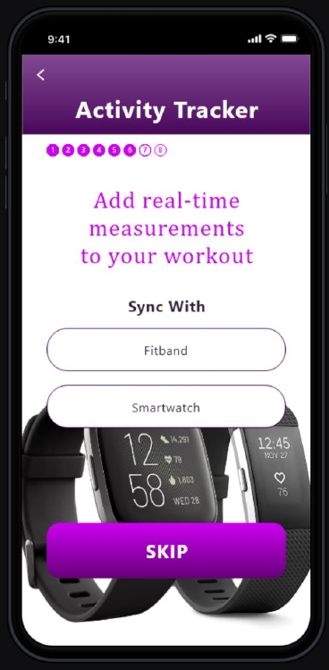
Sync with Fitbit or Smart Watch
There are many existing apps, which cater to workouts for their users. What would motivate users to prefer the “HomeBody Fitness” app above all of the other apps out there? I decided that I needed to build into the app, the option for users to sync their Fitband or smartwatch with the “HomeBody Fitness” app allowing them to get real-time biological measurements, i.e. heart rate, blood pressure, calories burned, etc. The hypothesis of this design functionality is: By providing personalized real-time measurements, users would be able to see what they accomplished during their workout and would prefer the “HomeBody Fitness app above other apps without this feature.
We all know working out is only one part of your overall fitness and health. What you put into your body is another vital and important part. I decided to add to the main navigation an option that allows users to view generic meal plans, or hire a health professional to create a personalized meal plan for them.
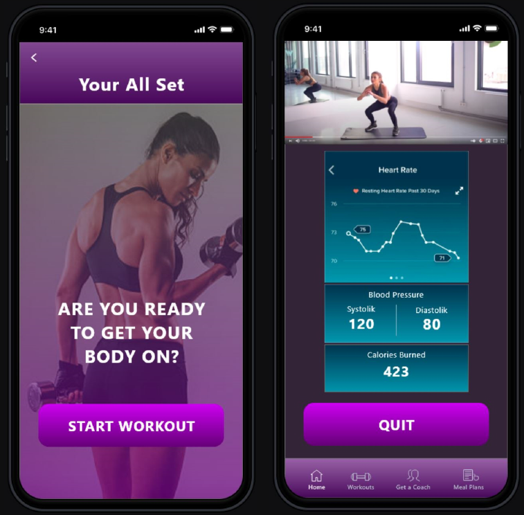
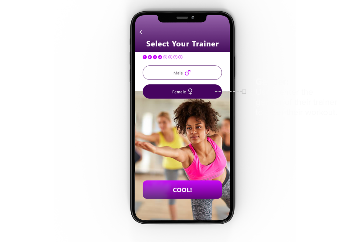
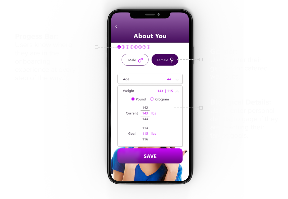
Fitness images are strategically placed to provide a visually stimulating onboarding experience. To add positive feedback and an element of fun, the main buttons include statements like sweet, cool, awesome, etc. A progress bar allows users to know how far along they are in the enrollment process.
THE GOAL
My goal in this design sprint was to create a user-centered prototype that would answer the challenges users voiced about home workout programs while making the experience fun, interactive, engaging, and beautiful.
DAY 5
USER TESTING
5 participants were chosen who matched the demographic of our target user. During these sessions, I learned a lot about the product’s weaknesses, holes, strengths, areas which needed improvements, as well as features that are needed to help the product grow and mature over time.
I was glad to see that the 5-day sprint was for the most part successful. My work paid off. Users were able to easily navigate through the onboarding experience and enjoyed the colors, images, and process.
However, the design wasn’t perfect. Here is a summary of the design challenges.
- 3 of the 5 users experienced confusion about how the app would connect with friends. These users provided valuable insights that allowed me to understand that my original design did not convey clearly how the app would function.
- One of the users suggested an introduction screen with a brief description would help people understand how the app would connect with their friends.
- Another user suggested that the app did not need to sync with their phone contacts because people will only have one or a small number of people in mind to workout with.
- Users had varying reactions to different elements of the design. One user complained that a handwriting font on a few screens was hard to read.
- When selecting the gender of the trainer, one user was confused about the female trainer image because it did not correspond with the exercise type she had selected earlier in the onboarding process, and suggested that an image without text would be less confusing.
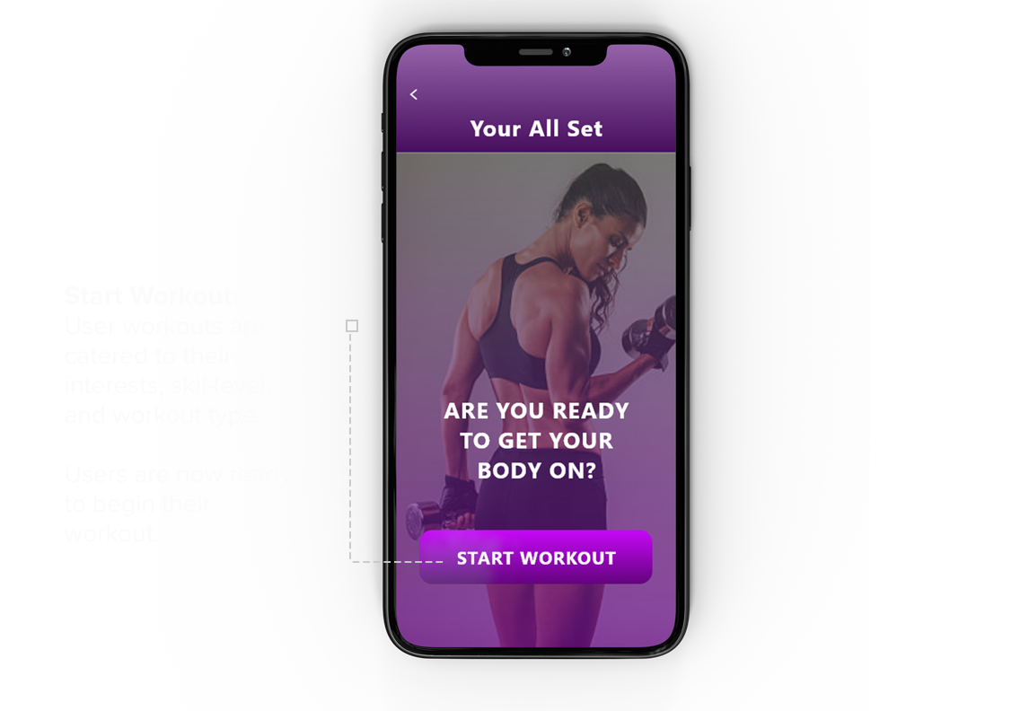
- One user did not like the final image on the confirmation page and suggested an image of a person working out would be better.
- 4 of the 5 users liked that the app could sync with the Fitband or smartwatch to provide real-time workout measurements, while one user was confused about this functionality because she was not familiar with Fitband and smartwatches.
I listened to each of these suggestions and considered how they would improve the design. I implemented most of their suggestions and tested the onboarding experience again with the same users and found during the second round of testing that the new design greatly improved the process, satisfied the users and the onboarding experience went much smoother.
WHAT I’VE LEARNED
The “Google Ventures Design Sprint” was an effective method that helps me quickly design an effective prototype that I could put in front of users for testing. Going through the steps to understand the user, user stories, and “how might we” questions was particularly helpful in determining the direction of the design. Additionally, performing lightning demos helped to stimulate design ideas and allowed me to move into storyboarding and prototyping with confidence and a clear road map. User testing confirmed for the most part that I hit the target and revealed areas that needed improvements. These steps have increased my confidence that the product’s design will both meet the needs of the user and be a delightful experience at the same time.
NEXT STEPS
The purpose of the “HomeBody Fitness” app is to provide a valuable solution to the millions of people who want to workout from home. This app creates a home workout program catered to users’ interests and skill levels and provides the reminders and accountability they need to accomplish their goals. Additional features including syncing their app with Fitbit or a smartwatch, inviting friends, and the option for the user to engage with fitness and health professionals, make “HomeBody Fitness” the app of choice when compared to the competition. This user-centered design best translates a gym routine to a home workout program.
While the process of designing the “HomeBody Fitness” app has been a rewarding experience, it needs some additional fine-tuning.
Further designs should include:
1 The development of the app once a user has completed the onboarding experience.
2 Additional research to identify the most popular home workout programs, based on age, gender, and user goals.
3 Additional research into the functionality of Fitbit and smartwatches to identify the key measurements this app will report during workouts.
Developing these next steps would provide additional insights and value to the “HomeBody Fitness” app. I hope you have gained some valuable insights as you have read through this case study and enjoyed the design sprint as much as I did. Cheers!
